 637e48ea26
|
||
|---|---|---|
| drivers | ||
| gui | ||
| images | ||
| setup_examples | ||
| .gitignore | ||
| LICENSE | ||
| README.md | ||
| hardware_setup.py | ||
| package.json | ||
README.md
micropython-micro-gui
This is a lightweight, portable, MicroPython GUI library for displays having
drivers subclassed from framebuf. Written in Python it runs under a standard
MicroPython firmware build. Options for data input comprise:
- Two pushbuttons: limited capabilities with some widgets unusable for input.
- Three pushbuttons with full capability.
- Five pushbuttons: full capability, less "modal" interface.
- A switch-based navigation joystick: another way to implement five buttons.
- Via two pushbuttons and a rotary encoder such as this one. An intuitive interface.
- On ESP32 physical buttons may be replaced with touchpads.
It is larger and more complex than nano-gui owing to the support for input.
It enables switching between screens and launching modal windows. Widgets are
a substantial superset of nano-gui widgets.
Supported displays
It is compatible with all display drivers for nano-gui so is portable to a wide range of displays. It is also portable between hosts.
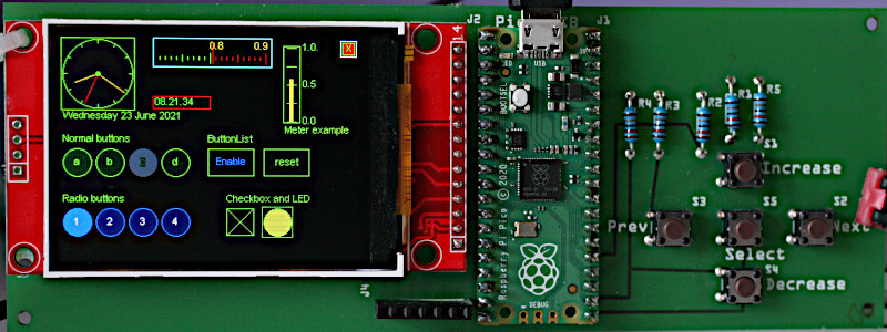
Raspberry Pico with an ILI9341 from eBay.
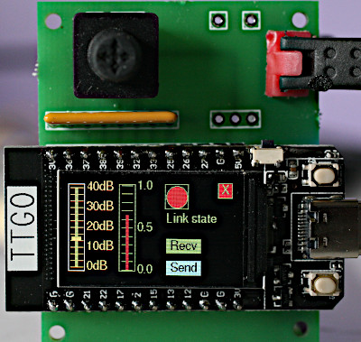
TTGO T-Display. A joystick switch and an SIL resistor make a simple inexpensive
and WiFi-capable system.
micro_gui now has limited support for ePaper.
Rationale
Touch GUI's are supported by micropython-touch. This GUI provides an alternative for displays without a touch overlay. A non-touch solution avoids the need for calibration and can also save cost. Cheap Chinese touch displays often marry a good display to a poor touch overlay. It can make sense to use such a screen with micro-gui, ignoring the touch overlay. For touch support it is worth spending money on a good quality device (for example Adafruit).
The micro-gui input options work well and can yield inexpensive solutions. A network-connected board with a 135x240 color display can be built for under £20 ($20?) using the TTGO T-Display. The test board shown above has a 320x240 display from eBay with a Pi Pico and has a component cost of well below £20.
The following are similar GUI repos with differing objectives.
- nano-gui Extremely low RAM usage but display-only with no provision for input.
- LCD160cr Touch GUI for the official display.
- RA8875 Touch GUI for displays with RA8875 controller. Supports large displays, e.g. from Adafruit.
- SSD1963 Touch GUI for displays based on SSD1963 and XPT2046. High performance on large displays due to the parallel interface. Specific to STM hosts.
LVGL is a pretty icon-based GUI library. It is written in C with MicroPython bindings; consequently it requires the build system for your target and a C device driver (unless you can acquire a suitable binary).
Project status
April 2024: Add screen replace feature for non-tree navigation.
Sept 2023: Add "encoder only" mode suggested by @eudoxos.
April 2023: Add limited ePaper support, grid widget, calendar and epaper demos.
Now requires firmware >= V1.20.
July 2022: Add ESP32 touch pad support.
June 2022: Add QRMap and
BitMap widgets.
March 2022: Add latency control for hosts with
SPIRAM.
February 2022: Supports use with only three buttons devised by Bart Cerneels.
Simplified widget import. Existing users should replace the entire gui tree.
Code has been tested on ESP32, ESP32-S2, ESP32-S3, Pi Pico and Pyboard. This is under development so check for updates.
0. Contents
- Basic concepts Including "Hello world" script.
1.1 Coordinates The GUI's coordinate system.
1.2 Screen Window and Widget objects Basic GUI classes.
1.3 Fonts
1.4 Navigation Options for hardware. How the GUI navigates between widgets.
1.4.1 Encoder-only mode Using only an encoder for navigation.
1.5 Hardware definition How to configure your hardware.
1.6 Quick hardware check Testing the hardware config. Please do this first.
1.7 Installation Installing the library.
1.8 Performance and hardware notes
1.9 Firmware and dependencies
1.10 Supported hosts and displays
1.11 Files Discussion of the files in the library.
1.11.1 Demos Simple demos showing coding techniques.
1.11.2 Test scripts GUI tests, some needing larger displays
1.12 Floating Point Widgets How to input floating point data. - Usage Application design.
2.1 Program structure and operation A simple demo of navigation and use.
2.2 Callbacks
2.3 Colors
2.3.1 Monochrome displays - The ssd and display objects
3.1 SSD class Instantiation in hardware_setup.
3.2 Display class Instantiation in hardware_setup.py.
3.2.1 Encoder usage
3.2.2 Encoder only mode - Screen class Full screen window.
4.1 Class methods
4.2 Constructor
4.3 Callback methods Methods which run in response to events.
4.4 Method Optional interface to asyncio code.
4.5 Class variable Control latency caused by garbage collection.
4.6 Usage Accessing data created in a screen. - Window class
5.1 Constructor
5.2 Class method
5.3 Popup windows - Widgets Displayable objects.
6.1 Label widget Single line text display.
6.1.1 Grid widget A spreadsheet-like array of labels.
6.2 LED widget Display Boolean values.
6.3 Checkbox widget Enter Boolean values.
6.4 Button and CloseButton widgets Pushbutton emulation.
6.5 ButtonList object Pushbuttons with multiple states.
6.6 RadioButtons object One-of-N pushbuttons.
6.7 Listbox widget
6.8 Dropdown widget Dropdown lists.
6.9 DialogBox class Pop-up modal dialog boxes.
6.10 Textbox widget Scrolling text display.
6.11 Meter widget Display floats on an analog meter, with data driven callbacks.
6.11.1 Region class
6.12 Slider and HorizSlider widgets Linear potentiometer float data entry and display
6.13 Scale widget High precision float entry and display.
6.14 ScaleLog widget Wide dynamic range float entry and display.
6.15 Dial widget Display multiple vectors.
6.16 Knob widget Rotary potentiometer float entry.
6.17 Adjuster widget Space saving way to enter floats.
6.18 Menu class
6.19 BitMap widget Draw bitmaps from files.
6.20 QRMap widget Draw QR codes created by uQR. - Graph plotting Widgets for Cartesian and polar graphs.
7.1 Concepts
7.1.1 Graph classes
7.1.2 Curve classes
7.1.3 Coordinates
7.2 Graph classes
7.2.1 Class CartesianGraph
7.2.2 Class PolarGraph
7.3 Curve classes
7.3.1 Class Curve
7.3.2 Class PolarCurve
7.4 Class TSequence Plotting realtime, time sequential data. - ESP32 touch pads Replacing buttons with touch pads.
- Realtime applications Accommodating tasks requiring fast RT performance.
- ePaper displays Guidance on using ePaper displays.
Appendix 1 Application design Tab order, button layout, encoder interface, use of graphics primitives, more on callbacks.
Appendix 2 Freezing bytecode Optional way to save RAM.
Appendix 3 Cross compiling Another way to save RAM.
1. Basic concepts
Internally micro-gui uses asyncio. It presents a conventional callback
based interface; knowledge of asyncio is not required for its use. Display
refresh is handled automatically. Widgets are drawn using graphics primitives
rather than icons. This makes them efficiently scalable and minimises RAM usage
compared to icon-based graphics. It also facilitates the provision of extra
visual information. For example the color of all or part of a widget may be
changed programmatically, for example to highlight an overrange condition.
There is limited support for
icons
in pushbuttons via icon fonts, also via the BitMap widget.
The following, taken from gui.demos.simple.py, is a complete application. It
shows a message and has "Yes" and "No" buttons which trigger a callback.
import hardware_setup  # Create a display instance
from gui.core.ugui import Screen, ssd

from gui.widgets import Label, Button, CloseButton
# from gui.core.writer import Writer  # Monochrome display
from gui.core.writer import CWriter
# Font for CWriter or Writer
import gui.fonts.arial10 as arial10
from gui.core.colors import *


class BaseScreen(Screen):

    def __init__(self):

        def my_callback(button, arg):
            print('Button pressed', arg)

        super().__init__()
        # wri = Writer(ssd, arial10, verbose=False)  # Monochrome display
        wri = CWriter(ssd, arial10, GREEN, BLACK, verbose=False)

        col = 2
        row = 2
        Label(wri, row, col, 'Simple Demo')
        row = 50
        Button(wri, row, col, text='Yes', callback=my_callback, args=('Yes',))
        col += 60
        Button(wri, row, col, text='No', callback=my_callback, args=('No',))
        CloseButton(wri)  # Quit the application

def test():
    print('Simple demo: button presses print to REPL.')
    Screen.change(BaseScreen)  # A class is passed here, not an instance.

test()
Notes:
- Monochrome displays use the
Writerclass rather thanCWriterto render fonts, as per the commented-out code above. - Hardware is defined by a single small file
hardware_setup.pywhich the user must edit.
1.1 Coordinates
These are defined as row and col values where row==0 and col==0
corresponds to the top left most pixel. Rows increase downwards and columns
increase to the right. The graph plotting widget uses normal mathematical
conventions within graphs.
Contents
1.2 Screen Window and Widget objects
A Screen is a window which occupies the entire display. A Screen can
overlay another, replacing all its contents. When closed, the Screen below is
re-displayed. This default method of navigation results in a tree structure of
Screen instances where the screen below retains state. An alternative allows
a Screen to replace another, allowing Screen instances to be navigated in an
arbitrary way. For example a set of Screen instances might be navigated in a
circular fashion. The penalty is that, to save RAM, state is not retained when a
Screen is replaced
A Window is a subclass of Screen but is smaller, with size and location
attributes. It can overlay part of an underlying Screen and is typically used
for dialog boxes. Window objects are modal: a Window can overlay a Screen
but cannot overlay another Window.
A Widget is an object capable of displaying data. Some are also capable of
data input: such a widget is defined as active. A passive widget can only
display data. An active widget can acquire focus. The widget with focus
is able to respond to user input. See navigation.
Widget objects have dimensions defined as height and width. The space
requred by them exceeds these dimensions by two pixels all round. This is
because micro-gui displays a surrounding white border to show which object
currently has focus. Thus to place a Widget at the extreme top left, row
and col values should be 2.
Contents
1.3 Fonts
Python font files are in the gui/fonts directory. The easiest way to conserve
RAM is to freeze them which is highly recommended. In doing so the directory
structure must be maintained.
To create alternatives, Python fonts may be generated from industry standard
font files with
font_to_py.py. The
-x option for horizontal mapping must be specified. If fixed pitch rendering
is required -f is also required. Supplied examples are:
arial10.pyVariable pitch Arial. 10 pixels high.arial35.pyArial 35 high.arial_50.pyArial 50 high.courier20.pyFixed pitch Courier, 20 high.font6.pyFreeSans 14 high.font10.pyFreeSans 17 high.freesans20.pyFreeSans 20 high.
The directory gui/fonts/bitmaps is only required for the bitmap.py demo.
Contents
1.4 Navigation
The GUI requires from 2 to 5 pushbuttons for control. These are:
NextMove to the next widget.SelectOperate the currently selected widget.PrevMove to the previous widget.IncreaseMove within the widget (i.e. adjust its value).DecreaseMove within the widget.
An alternative is to replace buttons 4 and 5 with a quadrature encoder knob
such as this one. That device has a
switch which operates when the knob is pressed: this may be wired for the
Select button. This provides the most intuitive operation.
Many widgets such as Pushbutton or Checkbox objects require only the
Select button to operate: it is possible to design an interface with a subset
of micro-gui widgets which requires only the first two buttons. With three
buttons all widgets may be used without restriction.
Widgets such as Listbox objects, dropdown lists (Dropdown), and those for
floating point data entry can use the Increase and Decrease buttons (or an
encoder) to select a data item or to adjust the linear value. If three buttons
are provided, the GUI will enter "adjust" mode in response to a double-click
of Select. In this mode Prev and Next act to decrease and increase the
widget's value. A further double-click restores normal navigation. This is
discussed in Floating Point Widgets.
The currently selected Widget is identified by a white border: the focus
moves between widgets via Next and Prev. Only active Widget instances
(those that can accept input) can receive the focus. Widgets are defined as
active or passive in the constructor, and this status cannot be changed. In
some cases the state can be specified as a constructor arg, but other widgets
have a predefined state. An active widget can be disabled and re-enabled at
runtime. A disabled active widget is shown "greyed-out" and cannot accept the
focus until re-enabled.
1.4.1 Encoder only mode
This uses a rotary encoder with a built-in pushbutton as the sole means of navigation, a mode suggested by @eudoxos. By default, turning the dial moves the currency between widgets; the widget with the focus has a white border. Widgets for numeric entry such as sliders and scales may be put into "adjust" mode with a double click. In that mode turning the dial adjusts the widget. Floating Point Widgets can enter "precision" adjustment mode with a long press of the button. "Adjust" and "precision" modes are cleared with a short button press.
This mode works well and its use is quite intuitive. Navigation by turning a dial makes it particularly useful when a screen has a large number of widgets.
Contents
1.5 Hardware definition
A file hardware_setup.py must exist in the GUI root directory. This defines
the connections to the display, the display driver, and pins used for the
pushbuttons. Example files may be found in the setup_examples directory.
Further examples (without pin definitions) are in this
nano-gui directory.
The following is a typical example for a Raspberry Pi Pico driving an ILI9341 display:
from machine import Pin, SPI, freq
import gc

from drivers.ili93xx.ili9341 import ILI9341 as SSD
freq(250_000_000)  # RP2 overclock
# Create and export an SSD instance
pdc = Pin(8, Pin.OUT, value=0)  # Arbitrary pins
prst = Pin(9, Pin.OUT, value=1)
pcs = Pin(10, Pin.OUT, value=1)
spi = SPI(0, baudrate=30_000_000)
gc.collect()  # Precaution before instantiating framebuf
# Instantiate display and assign to ssd. For args see display drivers doc.
ssd = SSD(spi, pcs, pdc, prst, usd=True)
# The following import must occur after ssd is instantiated.
from gui.core.ugui import Display, quiet
# quiet()
# Define control buttons
nxt = Pin(19, Pin.IN, Pin.PULL_UP)  # Move to next control
sel = Pin(16, Pin.IN, Pin.PULL_UP)  # Operate current control
prev = Pin(18, Pin.IN, Pin.PULL_UP)  # Move to previous control
increase = Pin(20, Pin.IN, Pin.PULL_UP)  # Increase control's value
decrease = Pin(17, Pin.IN, Pin.PULL_UP)  # Decrease control's value
# Create a Display instance and assign to display.
display = Display(ssd, nxt, sel, prev, increase, decrease)
Where an encoder replaces the increase and decrease buttons, only the final
line needs to be changed to provide an extra arg:
display = Display(ssd, nxt, sel, prev, increase, decrease, 4)
The final arg specifies the sensitivity of the attached encoder, the higher the value the more the knob has to be turned for a desired effect. A value of 1 provides the highest sensitivity, being the native rate of the encoder. Many encoders have mechanical detents: a value of 4 matches the click rate of most devices.
The commented-out quiet() line provides a means of suppressing diagnostic
messages.
Instantiation of SSD and Display classes is detailed in
section 3.
Display drivers are documented here.
Contents
1.6 Quick hardware check
The following may be pasted at the REPL to verify correct connection to the
display. It also confirms that hardware_setup.py is specifying a suitable
display driver.
from hardware_setup import ssd  # Create a display instance
from gui.core.colors import *
ssd.fill(0)
ssd.line(0, 0, ssd.width - 1, ssd.height - 1, GREEN)  # Green diagonal corner-to-corner
ssd.rect(0, 0, 15, 15, RED)  # Red square at top left
ssd.rect(ssd.width -15, ssd.height -15, 15, 15, BLUE)  # Blue square at bottom right
ssd.show()
Contents
1.7 Installation
Please ensure device firmware is up to date. Clone the repo to the PC with:
$ git clone https://github.com/peterhinch/micropython-micro-gui
$ cd micropython-micro-gui
In the micropython-micro-gui directory edit hardware_setup.py to match the
hardware in use.
The official mpremote tool is recommended. Install with:
$ pip3 install mpremote
There are several options for installation
- Using mpremote to run the GUI demos via the PC without installing.
- Subtractive. Installing the entire GUI, then (optionally) removing unused components.
- Additive. Installing a minimal subset and manually adding extra components.
- Using frozen bytecode.
Testing without installing
The easy way to start is to use mpremote which allows a directory on your PC
to be mounted on the host. In this way the filesystem on the host is left
unchanged. This is at some cost in loading speed, especially on ESP32. In the
micropython-micro-gui directory run:
$ mpremote mount .
This should provide a REPL. Run the minimal demo:
>>> import gui.demos.simple
If this runs the hardware is correctly configured and other demos should run.
Installing a display driver
It is necessary to install a display driver prior to any GUI installation. On networked hardware a display driver may be installed as follows (example is for ST7789):
>>> mip.install("github:peterhinch/micropython-nano-gui/drivers/st7789")
The last part of the addresss (st7789) is the name of the directory holding
drivers for the display in use. In cases where the directory holds more than
one driver all will be installed. Unused drivers may be deleted.
Install using mpremote on the PC as follows:
$ mpremote mip install "github:peterhinch/micropython-nano-gui/drivers/st7789"
Full installation (subtractive)
The entire GUI is large. It is possible to install it all from the PC clone by issuing:
$ cd micropython-micro-gui
$ mpremote cp -r gui :
$ mpremote cp hardware_setup.py :
This is rather profligate with Flash storage. There is great scope for discarding unused fonts, demos and widgets. As an alternative to installing everything and pruning, an additive approach may be used where a minimal subset is installed with extra fonts and widgets being added as required.
Minimal installation (additive)
This installs a subset adequate to run the simple.py demo. It comprises:
Note that mip and mpremote mip install to /lib/ which therefore becomes
the root of the above tree. The subset is installed with (on the device):
>>> mip.install("github:peterhinch/micropython-micro-gui")
or (on the PC):
$ mpremote mip install "github:peterhinch/micropython-micro-gui"
In both cases the edited hardware_setup.py must be copied from the PC:
$ cd micropython-micro-gui
$ mpremote cp hardware_setup.py :
When adding components the directory structure must be maintained. For example,
in the micropython-micro-gui directory:
$ mpremote cp gui/fonts/font10.py :/gui/fonts/
$ mpremote cp gui/widgets/checkbox.py :/gui/widgets/
Freezing bytecode
There is scope for speeding loading and saving RAM by using frozen bytecode.
The entire gui tree may be frozen but the directory structure must be
maintained. For reasons that are unclear freezing display drivers may not
work. For fexibility, consider keeping hardware_setup.py in the filesystem.
See Appendix 2 Freezing bytecode.
Contents
1.8 Performance and hardware notes
RAM usage
Running the linked_sliders demo, the code uses about 23,000 bytes with frozen
bytecode and 55,000 bytes without. To this must be added the size of the frame
buffer. This can readily be calculated. For example in the case of the ILI9341
(a 240x320 pixel unit whose driver uses 4-bit color) the buffer size is
240x320/2 = 38,400 bytes.
A Pico shows ~182000 bytes free with no code running. With linked_sliders
running on an ILI9341 display, it shows 120,896 bytes free with frozen
bytecode and 88,640 bytes free without.
With multi-pixel displays the size of the frame buffer can prevent the GUI from compiling. If frozen bytecode is impractical, consider cross-compiling. See Appendix 3 Cross compiling.
Speed
The consequence of inadequate speed is that brief button presses can be missed.
This is because display update blocks for tens of milliseconds, during which
time the pushbuttons are not polled. This can be an issue in displays with a
large number of pixels, multi-byte colors and/or slow SPI clock rates. In high
resolution cases the device driver has specfic asyncio support whereby the
driver yields to the scheduler a few times during the refresh.Currently this
exists on ILI9486, ILI9341 and ST7789 (e.g. TTGO T-Display). By my calculations
and measurements this should be unnecessary on other drivers, but please report
any tendency to miss button presses and I will investigate.
This may be mitigated by two approaches:
- Clocking the SPI bus as fast as possible. This is discussed in the drivers doc.
- Clocking the host fast (
machine.freq).
Platform notes
On ESP32 (including the TTGO T-Display) note that pins 36-39 are input-only and do not have pullup support: if these are used for pushbutton input, physical pullups to 3.3V should be used. See ref.
On a Pyboard 1.1 with 320x240 ili9341 display it was necessary to use frozen
bytecode: in this configuration running the various.py demo there was 29K of
free RAM. Note that, at 37.5KiB, this display is the worst-case in terms of
RAM usage. A smaller display or a Pyboard D would offer more headroom. Frozen
bytecode was also necessary on an RP2 running an ILI9486: a 480x320 display
requires a 76,800 byte frame buffer.
Contents
1.9 Firmware and dependencies
Firmware should be V1.17 or later. The source tree includes all dependencies. These are listed to enable users to check for newer versions or to read docs:
- writer.py Provides text rendering of Python font files.
- SSD1306 driver. A copy of the official driver for OLED displays using the SSD1306 chip is provided. The link is to the official file.
- Synchronisation primitives.
The link is to my
asynciosupport repo. - PCD8544/Nokia 5110. Displays based on the Nokia 5110 (PCD8544 chip) require this driver. It is not provided in this repo. The link is to its source.
Contents
1.10 Supported hosts and displays
Development was done using a Raspberry Pi Pico connected to a cheap ILI9341
320x240 display. I have also tested a TTGO T-Display (an ESP32 host) and a
Pyboard. Code is written with portability as an aim, but MicroPython configs
vary between platforms and I can't guarantee that every widget will work on
every platform. For example, some use the cmath module which may be absent on
some builds.
Supported displays are as per the nano-gui list. In general ePaper and Sharp displays are unlikely to yield good results because of slow and visually intrusive refreshing. However there is an exception: the Waveshare pico_epaper_42. See 10. ePaper displays.
Display drivers are documented here.
Contents
1.11 Files
Display drivers may be found in the drivers directory. These are copies of
those in nano-gui, included for convenience. Note the file
drivers/boolpalette.py, required by all color drivers.
The system is organised as a Python package with the root being gui. Core
files in gui/core are:
colors.pyConstants including colors and shapes.ugui.pyThe main GUI code.writer.pySupports theWriterandCWriterclasses.
The gui/primitives directory contains the following files:
pushbutton.pyInterface to physical pushbuttons and ESP32 touch pads.delay_ms.pyA software triggerable timer.encoder.pyDriver for a quadrature encoder. This offers an alternative interface - see Appendix 1.
The gui/demos directory contains a variety of demos and tests described
below.
1.11.1 Demos
Demos are run by issuing (for example):
>>> import gui.demos.simple
If shut down cleanly with the "close" button a demo can be re-run with (e.g.):
gui.demos.simple.test()
Before running a different demo the host should be reset (ctrl-d) to clear RAM.
These will run on screens of 128x128 pixels or above. The initial ones are minimal and aim to demonstrate a single technique.
simple.pyMinimal demo discussed below.Buttonpresses print to REPL.checkbox.pyACheckboxcontrolling anLED.slider.pyASliderwhose color varies with its value.slider_label.pyASliderupdating aLabel. Good for trying precision mode.linked_sliders.pyOneSliderupdating two others, and a coding "wrinkle" required for doing this.dropdown.pyA dropdown list (with scrolling) updates aLabel.listbox.pyA listbox with scrolling.dialog.pyDialogBoxdemo. Illustrates the screen change mechanism.screen_change.pyAPushbuttoncausing a screen change using a re-usable "forward" button.screen_replace.pyA more complex (non-tree) screen layout.primitives.pyUse of graphics primitives.aclock.pyAn analog clock using theDialvector display. Also shows screen layout using widget metrics. Has a simpleasynciotask.tbox.pyText boxes and user-controlled scrolling.tstat.pyA demo of theMeterclass with data sensitive regions.menu.pyA multi-level menu.adjuster.pySimple demo of theAdjustercontrol.adjust_vec.pyA pair ofAdjusters vary a vector.bitmap.pyDemo of theBitMapwidget showing a changing image. (See widget docs).qrcode.pyDisplay a QR code. Requires the uQR module.calendar.pyDemo of grid widget.epaper.pyWarts-and-all demo for an ePaper display. Currently the only supported display is the Waveshare pico_epaper_42 with Pico or other host.
1.11.2 Test scripts
These more complex demos are run in the same way by issuing (for example):
>>> import gui.demos.active
Some of these require larger screens. Required sizes are specified as (height x width).
active.pyDemonstratesactivecontrols providing floating point input (240x320).plot.pyGraph plotting (128x200).screens.pyListbox, dropdown and dialog boxes (128x240).various.pyAssorted widgets including the different types of pushbutton (240x320).vtest.pyClock and compass styles of vector display (240x320).calendar.pyDemo of grid control (240x320 - but could be reduced).
Contents
1.12 Floating Point Widgets
Some applications need to adjust a data value with an extremely large dynamic range. This is the ratio of the data value's total range to the smallest adjustment that can be made. The mechanism currently implemented enables a precision of 0.05%.
Floating point widgets respond to a brief press of the increase or decrease
buttons by adjusting the value by a small amount. A continued press causes the
value to be repeatedly adjusted, with the amount of the adjustment increasing
with time. This enables the entire range of the control to be accessed quickly,
while allowing small changes of 0.5%. This works well. In many cases the level
of precision will suffice. An encoder provides similar performance.
Fine adjustments may be achieved by pressing the select button for at least
one second. The GUI will respond by changing the border color from white
(i.e. has focus) to yellow. In this mode a brief press of increase or
decrease or small movement of an encoder will have a reduced effect (0.05%).
Fine mode may be cancelled by pressing select or by moving the focus to
another control. This also works in three-button mode, with Next and Prev
performing the adjustments.
In the case of slider and knob controls the precision of fine mode exceeds that
of the visual appearance of the widget: fine changes can be too small to see.
Options are to use the Scale widget or to have a
linked Label showing the widget's exact value.
The callback runs whenever the widget's value changes. This causes the callback
to run repeatedly while the user adjusts the widget. This is required if there
is a linked Label to update.
Contents
2. Usage
2.1 Program structure and operation
The following is a minimal script (found in gui.demos.simple.py) which will
run on a minimal system with a small display and two pushbuttons. Commented out
code shows changes for monochrome displays.
The demo provides two Button widgets with "Yes" and "No" legends. It may be
run by issuing at the REPL:
>>> import gui.demos.simple
Note that the import of hardware_setup.py is the first line of code. This is
because the frame buffer is created here, with a need for a substantial block
of contiguous RAM.
import hardware_setup  # Instantiate display, setup color LUT (if present)
from gui.core.ugui import Screen, ssd

from gui.widgets import Label, Button, CloseButton
# from gui.core.writer import Writer  # Monochrome display
from gui.core.writer import CWriter

# Font for CWriter
import gui.fonts.arial10 as arial10
from gui.core.colors import *


class BaseScreen(Screen):

    def __init__(self):

        def my_callback(button, arg):
            print('Button pressed', arg)

        super().__init__()
        # wri = Writer(ssd, arial10, verbose=False)
        wri = CWriter(ssd, arial10, GREEN, BLACK, verbose=False)

        col = 2
        row = 2
        Label(wri, row, col, 'Simple Demo')
        row = 20
        Button(wri, row, col, text='Yes', callback=my_callback, args=('Yes',))
        col += 60
        Button(wri, row, col, text='No', callback=my_callback, args=('No',))
        CloseButton(wri)  # Quit the application

def test():
    print('Testing micro-gui...')
    Screen.change(BaseScreen)

test()
Note how the Next pushbutton moves the focus between the two buttons and the
"X" close button. The focus does not move to the "Simple Demo" widget because
it is not active: a Label cannot accept user input. Pushing the Select
pushbutton while the focus is on a Pushbutton causes the callback to run.
Applications start by performing Screen.change() to a user-defined Screen
object. This must be subclassed from the GUI's Screen class. Note that
Screen.change accepts a class name, not a class instance.
The user defined BaseScreen class constructor instantiates all widgets to be
displayed and typically associates them with callback functions - which may be
bound methods. Screens typically have a CloseButton widget. This is a special
Pushbutton subclass which displays as an "X" at the top right corner of the
physical display and closes the current screen, showing the one below. If used
on the bottom level Screen (as above) it closes the application.
The CWriter instance wri associates a widget with a font. Constructors for
all widgets have three mandatory positional args. These are a CWriter
instance followed by row and col. These args are followed by a number of
optional keyword args. These have (hopefully) sensible defaults enabling you to
get started easily. Monochrome displays use the simpler Writer class.
Contents
2.2 Callbacks
The interface is event driven. Widgets may have optional callbacks which will
be executed when a given event occurs. Events occur when a widget's properties
are changed programmatically, and also (in the case of active widgets) in
response to user input.
A callback function receives positional arguments. The first is a reference to the object raising the callback. Subsequent arguments are user defined, and are specified as a tuple or list of items. Callbacks and their argument lists are optional: a default null function and empty tuple are provided. Callbacks may optionally be written as bound methods. This facilitates communication between widgets.
When writing callbacks take care to ensure that the correct number of arguments are passed, bearing in mind the first arg described above. An incorrect argument count results in puzzling tracebacks which appear to implicate the GUI code. This is because it is the GUI which actually executes the callbacks.
Callbacks should complete quickly. See Appendix 1 Application design for discussion of this.
Contents
2.3 Colors
The file gui/core/colors.py defines a set of color constants which may be
used with any display driver. This section describes how to change these or
to create additional colors. Most of the color display drivers define colors
as 8-bit or larger values. For the larger displays 4-bit drivers are provided
with the aim of conserving RAM.
In the 4-bit case colors are assigned to a lookup table (LUT) with 16 entries.
The frame buffer stores 4-bit color values, which are converted to the correct
color depth for the hardware when the display is refreshed. Of the 16 possible
colors 13 are assigned in gui/core/colors.py, leaving color numbers 12, 13
and 14 free.
The following code is portable between displays and creates a user defined
color PALE_YELLOW.
from gui.core.colors import *  # Imports the create_color function
PALE_YELLOW = create_color(12, 150, 150, 0)  # index, r, g, b
If a 4-bit driver is in use, the color rgb(150, 150, 0) will be assigned to
"spare" color number 12. Any color number in range 0 <= n <= 15 may be
used, implying that predefined colors may be reassigned. It is recommended
that BLACK (0) and WHITE (15) are not changed. If an 8-bit or larger driver
is in use, the color number is ignored and there is no practical restriction on
the number of colors that may be created.
In the above example, regardless of the display driver, the PALE_YELLOW
variable may be used to refer to the color. An example of custom color
definition may be found in
this nano-gui demo.
There are five default colors which are defined by a color_map list. These
may be reassigned in user code. For example the following will cause the border
of any control with the focus to be red:
from colors import *
color_map[FOCUS] = RED
The color_map index constants and default colors (defined in colors.py)
are:
| Index | Color | Purpose |
|---|---|---|
| FOCUS | WHITE | Border of control with focus |
| PRECISION | YELLOW | Border in precision mode |
| FG | WHITE | Window foreground default |
| BG | BLACK | Background default including screen clear |
| GREY_OUT | GREY | Color to render greyed-out controls |
Contents
2.3.1 Monochrome displays
Most widgets work on monochrome displays if color settings are left at default values. If a color is specified, drivers in this repo will convert it to black or white depending on its level of saturation. A low level will produce the background color, a high level the foreground.
At the bit level 1 represents the foreground. This is white on an emitting
display such as an OLED. On a Sharp display it indicates reflection.
There is an issue regarding ePaper displays discussed here. The driver for the Waveshare pico_epaper_42 renders colored objects as black on white.
Contents
3. The ssd and display objects
The following code, issued as the first executable lines of an application, initialises the display.
import hardware_setup  # Create a display instance
from gui.core.ugui import Screen, ssd, display  # display symbol is seldom needed
The hardware_setup file creates singleton instances of SSD and Display
classes. These instances are made available via ugui. Normal GUI applications
only need to import ssd. This refererence to the display driver is used to
initialise Writer objects. Bound variables ssd.height and ssd.width may
be read to determine the dimensions of the display hardware.
The display object is only needed in applications which use graphics
primitives to write directly to the screen. See
Appendix 1 Application design.
3.1 SSD class
This is instantiated in hardware_setup.py. The specific class must match the
display hardware in use. Display drivers are documented
here.
3.2 Display class
This is instantiated in hardware_setup.py. It registers the SSD instance
along with the Pin instances used for input; also whether an encoder is used.
Pins are arbitrary, but should be defined as inputs with pullups. Pushbuttons
are connected between Gnd and the relevant pin.
The constructor takes the following positional args:
objssdTheSSDinstance. A reference to the display driver.nxtAPininstance for thenextbutton.selAPininstance for theselectbutton.prev=NoneAPininstance for thepreviousbutton (if used).incr=NoneAPininstance for theincreasebutton (if used).decr=NoneAPininstance for thedecreasebutton (if used).encoder=FalseIf an encoder is used, an integer must be passed.touch=FalseSupply an integer to use ESP32TouchPadinstances in place of all physical pushbuttons. See ESP32 touch pads.
Class variables:
verbose=TrueCauses a message to be printed indicating whether an encoder was specified.
3.2.1 Encoder usage
If an encoder is used, it should be connected to the pins assigned to
increase and decrease. If the direction of movement is wrong, these pins
should be transposed (physically or in code).
To specify to the GUI that an encoder is in use an integer should be passed to
the Display constructor encoder arg. Its value represents the division
ratio. A value of 1 defines the native rate of the encoder; if the native rate
is 32 pulses per revolution, a value of 4 would yield a virtual device with
8 pulses per rev. A value of 4 matches most encoders with mechanical detents.
If an encoder is used but the encoder arg is False, response to the encoder
will be erratic.
3.2.2 Encoder only mode
This uses an encoder with an included pushbutton as the sole means of control. To use this mode, constructor args should be:
objssdTheSSDinstance. A reference to the display driver.nxtAPininstance attached to the encoder X pin.selAPininstance attached to the encoder button.prevAPininstance attached to the encoder Y pin.incr=False. Must setFalse.decr=None.encoderAnintdefining the division ratio as above.
Contents
4. Screen class
The Screen class presents a full-screen canvas onto which displayable
objects are rendered. Before instantiating widgets a Screen instance must be
created. This will be current until another is instantiated. When a widget is
instantiated it is associated with the current screen.
All applications require the creation of at least one user screen. This is done
by subclassing the Screen class. Widgets are instantiated in the Screen
constructor. Widgets may be assigned to bound variable: this facilitates
communication between them.
Contents
4.1 Class methods
In normal use only change and back are required, to move to a new Screen
and to drop back to the previous Screen in a tree (or to quit the application
if there is no predecessor).
change(cls, cls_new_screen, mode=Screen.STACK, *, args=[], kwargs={})
Change screen, refreshing the display. Mandatory positional argument: the new screen class name. This must be a class subclassed fromScreen. The class will be instantiated and displayed. Optional keyword argumentsargs,kwargsenable passing positional and keyword arguments to the constructor of the new, user defined, screen. By default the new screen overlays the old. When the newScreenis closed (viaback) the old is re-displayed having retained state. Ifmode=Screen.REPLACEis passed the old screen instance is deleted. The new one retains the parent of the old, so if it is closed that parent is re-displayed with its state retained. This enables arbitrary navigation between screens (directed graph rather than tree structure). See demoscreen_replace.back(cls)Restore previous screen. If there is no parent, quits the application.
These are uncommon:
shutdown(cls)Clear the screen and shut down the GUI. Normally done by aCloseButtoninstance.show(cls, force). This causes the screen to be redrawn. IfforceisFalseunchanged widgets are not refreshed. IfTrue, all visible widgets are re-drawn. Explicit calls to this should never be needed.
See demos/plot.py for an example of multi-screen design, or
screen_change.py for a minimal example demostrating the coding technique.
Contents
4.2 Constructor
This takes no arguments.
4.3 Callback methods
These are null functions which may be redefined in user subclasses.
on_open(self)Called when a screen is instantiated but prior to display.after_open(self)Called after a screen has been displayed.on_hide(self)Called when a screen ceases to be current.
See demos/plot.py for examples of usage of after_open.
4.4 Method
reg_task(self, task, on_change=False)The first arg may be aTaskinstance or a coroutine. Returns the passedtaskobject.
This is a convenience method which provides for the automatic cancellation of
tasks. If a screen runs independent tasks it can opt to register these. If the
screen is overlaid by another, tasks registered with on_change True are
cancelled. If the screen is closed, all tasks registered to it are cancelled
regardless of the state of on_change. On shudown, any tasks registered to the
base screen are cancelled.
For finer control, applications can ignore this method and handle cancellation explicitly in code.
4.5 Class variable
do_gc = TrueBy default a coroutine is launched to periodically perform garbage collection (GC). On most platforms this reduces latency by doing GC before too much garbage has accumulated. However on platforms with SPIRAM GC can take hundreds of ms, causing unacceptable latency. Ifdo_gcisFalsethe application can perform GC at times when fast response to user actions is not required. If turned off, the GC task cannot be re-started.
4.6 Usage
The Screen.change() classmethod returns immediately. This has implications
where the new, top screen sets up data for use by the underlying screen. One
approach is for the top screen to populate class variables. These can be
acccessed by the bottom screen's after_open method which will run after the
top screen has terminated.
If a Screen throws an exception when instantiated, check that its constructor
calls super().__init__().
Contents
5. Window class
This is a Screen subclass providing for modal windows. As such it has
positional and dimension information. Usage consists of writing a user class
subclassed from Window. Example code is in demos/screens.py. Code in a
window must not attempt to open another Window or Screen. Doing so will
raise a ValueError. Modal behaviour means that the only valid screen change
is a return to the calling screen.
5.1 Constructor
This takes the following positional args:
rowcolheightwidth
Followed by keyword-only args
draw_border=Truebgcolor=NoneBackground color, default black.fgcolor=NoneForeground color, default white.writer=NoneSee Popups below.
5.2 Class method
value(cls, val=None)Thevalarg can be any Python type. It allows widgets on aWindowto store information in a way which can be accessed from the calling screen. This typically occurs after the window has closed and no longer exists as an instance.
Another approach, demonstrated in demos/screens.py, is to pass one or more
callbacks to the user window constructor args. These may be called by widgets
to send data to the calling screen. Note that widgets on the screen below will
not be updated until the window has closed.
5.3 Popup windows
In general Screen and Window instances need at least one active widget.
There is a special case of a popup window which typically displays status data,
possibly with a progress meter. A popup has no user controls and is closed by
user code. A popup is created by passing a Writer (or CWriter) to the
constructor and is closed by issuing the close() static method.
Contents
6. Widgets
6.1 Label widget
from gui.widgets import Label # File: label.py
Various styles of Label.
The purpose of a Label instance is to display text at a specific screen
location.
Text can be static or dynamic. In the case of dynamic text the background is cleared to ensure that short strings cleanly replace longer ones.
Labels can be displayed with an optional single pixel border.
Colors are handled flexibly. By default the colors used are those of the
Writer instance, however they can be changed dynamically; this might be used
to warn of overrange or underrange values. The color15.py demo illustrates
this.
Constructor args:
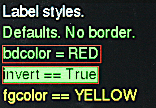
writerTheWriterinstance (font and screen) to use.rowLocation on screen.coltextIf a string is passed it is displayed: typically used for static text. If an integer is passed it is interpreted as the maximum text length in pixels; typically obtained fromwriter.stringlen('-99.99'). Nothing is dsplayed until.value()is called. Intended for dynamic text fields.invert=FalseDisplay in inverted or normal style.fgcolor=NoneColor of foreground (the control itself). IfNonetheWriterforeground default is used.bgcolor=BLACKBackground color of object. IfNonetheWriterbackground default is used.bdcolor=FalseColor of border. IfFalseno border will be drawn. IfNonethefgcolorwill be used, otherwise a color may be passed. If a color is available, a border line will be drawn around the control.justify=Label.LEFTOptions areLabel.RIGHTandLabel.CENTRE(note British spelling). Justification can only occur if there is sufficient space in theLabeli.e. where an integer is supplied for thetextarg.
The constructor displays the string at the required location.
Method:
value Redraws the label. This takes the following args:
text=NoneThe text to display. IfNonedisplays last value.invert=FalseIf true, show inverse text.fgcolor=NoneForeground color: ifNonetheWriterdefault is used.bgcolor=NoneBackground color, as per foreground.bdcolor=NoneBorder color. As per above except that ifFalseis passed, no border is displayed. This clears a previously drawn border.
Returns the current text string.justify=NoneBy default justify using the constructor default. Override withLabel.LEFT,Label.RIGHTorLabel.CENTRE.
If the value method is called with a text string too long for the Label the
text will be clipped to fit the width. In this case value() will return the
truncated text.
If constructing a label would cause it to extend beyond the screen boundary a warning is printed at the console. The label may appear at an unexpected place. The following is a complete "Hello world" script.
from hardware_setup import ssd  # Create a display instance
from gui.core.ugui import Screen
from gui.core.writer import CWriter
from gui.core.colors import *

from gui.widgets import Label, CloseButton
import gui.fonts.freesans20 as freesans20


class BaseScreen(Screen):

    def __init__(self):
        super().__init__()
        wri = CWriter(ssd, freesans20, GREEN, BLACK, verbose=False)
        Label(wri, 2, 2, 'Hello world!')
        CloseButton(wri)

Screen.change(BaseScreen)
Contents
6.1.1 Grid widget
from gui.widgets import Grid # Files: grid.py, parse2d.py
This is a rectangular array of Label instances: as such it is a passive
widget. Rows are of a fixed height equal to the font height + 4 (i.e. the label
height). Column widths are specified in pixels with the column width being the
specified width +4 to allow for borders. The dimensions of the widget including
borders are thus:
height = no. of rows * (font height + 4)
width = sum(column width + 4)
Cells may be addressed as a 1 or 2-dimensional array.
Constructor args:
writerTheWriterinstance (font and screen) to use.rowLocation of grid on screen.collwidthIf an integer N is passed all labels will have width of N pixels. A list or tuple of integers will define the widths of successive columns. If the list has fewer entries than there are columns, the last entry will define the width of those columns. Thus[20, 30]will produce a grid with column 0 being 20 pixels and all subsequent columns being 30.nrowsNumber of rows.ncolsNumber of columns.invert=FalseDisplay in inverted or normal style.fgcolor=NoneColor of foreground (the control itself). IfNonetheWriterforeground default is used.bgcolor=BLACKBackground color of cells. IfNonetheWriterbackground default is used.bdcolor=NoneColor of border of the widget and its internal grid. IfFalseno border or grid will be drawn. IfNonethefgcolorwill be used, otherwise a color may be passed.justify=Label.LEFTOptions areLabel.RIGHTandLabel.CENTRE(note British spelling). Justification can only occur if there is sufficient space in theLabelas defined bylwidth.
Method:
__getitem__Returns an iterator enablingLabelinstances to be accessed.__setitem__Assign a value to one or more labels. If multiple labels are specified and a single text value is passed, all labels will receive that value. If an iterator is passed, consecutive labels will receive values from the iterator. If the iterator runs out of data, the last value will be repeated.
Addressing:
The Label instances may be addressed as a 1D array as follows
grid[20] = str(42)
grid[20:25] = iter([str(n) for n in range(20, 25)])
or as a 2D array:
grid[2, 5] = "A"  # Row == 2, col == 5
grid[0:7, 3] = "b"  # Populate col 3 of rows 0..6
grid[1:3, 1:3] = (str(n) for n in range(25))  # Produces
# 0 1
# 2 3
Columns are populated from left to right, rows from top to bottom. Unused iterator values are ignored. If an iterator runs out of data the last value is repeated, thus
grid[1:3, 1:3] = (str(n) for n in range(2))  # Produces
# 0 1
# 1 1
Read access:
for label in grid[2, 0:]:
    v = label.value()  # Access text of each label in row 2
Example uses:
colwidth = (20, 30)  # Col 0 width is 20, subsequent columns 30
self.grid = Grid(wri, row, col, colwidth, rows, cols, justify=Label.CENTRE)
self.grid[20] = ""  # Clear cell 20 by setting its value to ""
self.grid[2, 5] = str(42)  # 2D array syntax
grid[1:6, 0] = iter("ABCDE")  # Label row and col headings
grid[0, 1:cols] = (str(x + 1) for x in range(cols))
d = {}  # For indiviual control of cell appearance
d["fgcolor"] = RED
d["text"] = str(99)
self.grid[3, 7] = d  # Specify color as well as text
del d["fgcolor"]  # Revert to default
d["invert"] = True
self.grid[17] = d
See the example calendar.py.
Contents
6.2 LED widget
from gui.widgets import LED # File: led.py
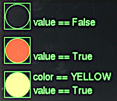
This is a virtual LED whose color may be altered dynamically. An LED may be
defined with a color and turned on or off by setting .value to a boolean. For
more flexibility the .color method may be use to set it to any color.
Constructor mandatory positional args:
writerTheWriterinstance (defines font) to use.rowLocation on screen.col
Keyword only args:
height=30Height of LED.fgcolor=NoneColor of foreground (the control itself). IfNonetheWriterforeground default is used.bgcolor=NoneBackground color of object. IfNonetheWriterbackground default is used.bdcolor=FalseColor of border. IfFalseno border will be drawn. If a color is provided, a border line will be drawn around the control. shown in the foreground color. If a color is passed, it is used.color=REDColor when illuminated (i.e. ifvalueisTrue.
Methods:
valueargval=NoneIfTrueis passed, lights theLEDin its current color.Falseextinguishes it.Nonehas no effect. Returns current value.colorargc=NoneChange the LED color toc. IfcisNonethe LED is turned off (rendered in the background color).
Note that __call__ is a synonym for value. An LED instance can be
controlled with led(True) or led(False).
Contents
6.3 Checkbox widget
from gui.widgets import Checkbox # File: checkbox.py
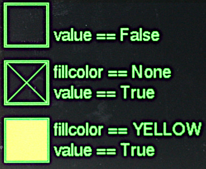
This provides for Boolean data entry and display. In the True state the
control can show an 'X' or a filled block of any color depending on the
fillcolor constructor arg.
Constructor mandatory positional args:
writerTheWriterinstance (defines font) to use.rowLocation on screen.col
Optional keyword only arguments:
height=30Dimension of the square bounding box. Default 30 pixels.fillcolor=NoneFill color of checkbox whenTrue. IfNonean 'X' will be drawn.fgcolor=NoneColor of foreground (the control itself). IfNonetheWriterforeground default is used.bgcolor=NoneBackground color of object. IfNonetheWriterbackground default is used.bdcolor=FalseColor of border. IfFalseno border will be drawn. If a color is provided, a border line will be drawn around the control.callback=dolittleCallback function which will run when the value changes. The default is a null function.args=[]A list/tuple of arguments for above callback.value=FalseInitial value.active=TrueBy default user input is accepted.
Methods:
greyed_outOptional Boolean argumentval=None. IfNonereturns the current 'greyed out' status of the control. Otherwise enables or disables it, showing it in its new state.valueOptional Boolean argumentval. If the provided value does not correspond to the control's current value, updates it; the checkbox is re-drawn and the callback executed. Always returns the control's value.
Contents
6.4 Button and CloseButton widgets
from gui.core.colors import *  # Colors and shapes
from gui.widgets import Button  # File: buttons.py
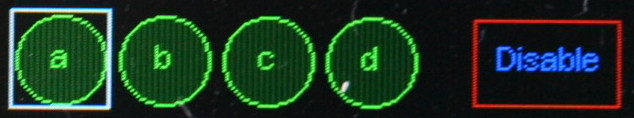
Using an icon font:
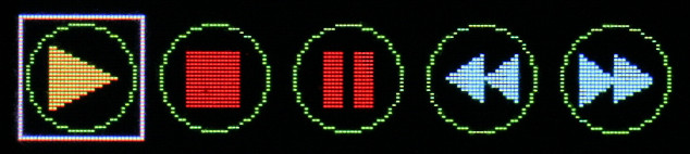
In these images Button "a" and the "Forward" button have the focus. Pressing
the physical select button will press the virtual Button.
This emulates a pushbutton, with a callback being executed each time the button
is pressed. Physically this consists of pressing the select button when the
Button instance has focus. Buttons may be any one of three shapes: CIRCLE,
RECTANGLE or CLIPPED_RECT.
Constructor mandatory positional args:
writerTheWriterinstance (defines font) to use.rowLocation on screen.col
Optional keyword only arguments:
shape=RECTANGLEMust beCIRCLE,RECTANGLEorCLIPPED_RECT.height=20Height of button or diameter inCIRCLEcase.width=50Width of button. Iftextis supplied andwidthis too low to accommodate the text, it will be increased to enable the text to fit. InCIRCLEcase any passed value is ignored.fgcolor=NoneColor of foreground (the control itself). IfNonetheWriterforeground default is used.bgcolor=NoneBackground color of object. IfNonetheWriterbackground default is used.bdcolor=FalseColor of border. IfFalseno border will be drawn. If a color is provided, a border line will be drawn around the control.textcolor=NoneText color. Defaults tofgcolor.litcolor=NoneIf provided the button will display this color for one second after being pressed.text=''Shown in centre of button. It is possible to show simple icons, for example media playback symbols.callback=dolittleCallback function which runs when button is pressed.args=()A list/tuple of arguments for the above callback.
Method:
greyed_outOptional Boolean argumentval=None. IfNonereturns the current 'greyed out' status of the control. Otherwise enables or disables it, showing it in its new state.
Class variable:
lit_time=1000Period in ms thelitcoloris displayed.
CloseButton
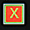
This example has focus, as shown by white border.
This Button subclass is a special case of a Button. Its constructor takes a
single arg, being a Writer instance. It produces a red "X" button at the top
right hand corner of the current Screen. Operating it causes the screen to
close, with the screen below being revealed. On the bottom level screen, a
CloseButton will shut down the application.
Constructor mandatory positional arg:
- writer
Optional keyword only arguments:
width=0By default dimensions are calculated from font size. The button is is square. Optionallywidthmay be specified.callback=dolittleOptional callback, not normally required.args=()Args for above.bgcolor=RED
Contents
6.5 ButtonList object
from gui.core.colors import *  # Colors and shapes
from gui.widgets import Button, ButtonList  # File: buttons.py
A ButtonList groups a number of buttons together to implement a button which
changes state each time it is pressed. For example it might toggle between a
green Start button and a red Stop button. The buttons are defined and added in
turn to the ButtonList object. Typically they will be the same size, shape
and location but will differ in color and/or text. At any time just one of the
buttons will be visible, initially the first to be added to the object.
Buttons in a ButtonList should not have callbacks. The ButtonList has
its own user supplied callback which runs each time the object is pressed.
However each button can have its own list of args. Callback arguments
comprise the currently visible button followed by its arguments.
Constructor argument:
callback=dolittleThe callback function. Default does nothing.
Methods:
add_buttonAdds a button to theButtonList. Arguments: as per theButtonconstructor. Returns the button object.greyed_outOptional Boolean argumentval=None. IfNonereturns the current 'greyed out' status of the control. Otherwise enables or disables it, showing it in its new state.valueOptional argsbutton=None,new_cb=False. Thebuttonarg, if provided, should be a button in the set. If supplied and the button is not active the currency changes to the supplied button, which is displayed. By default the callback of the previous button is run, otherwise the callback of the newly displayed button.
Always returns the active button.
Counter intuitively, running the callback of the previous button is normal
behaviour. Consider a ButtonList consisting of ON and OFF buttons. If ON is
visible this implies that the machine under control is off. Pressing select
causes the ON callback to run, starting the machine. The new button displayed
now reads OFF.
Typical usage is as follows:
def callback(button, arg):
    print(arg)

table = [
     {'fgcolor' : GREEN, 'shape' : CLIPPED_RECT, 'text' : 'Start', 'args' : ['Live']},
     {'fgcolor' : RED, 'shape' : CLIPPED_RECT, 'text' : 'Stop', 'args' : ['Die']},
]
bl = ButtonList(callback)
for t in table:  # Buttons overlay each other at same location
    bl.add_button(wri, 10, 10, textcolor = BLACK, **t)
Contents
6.6 RadioButtons object
from gui.core.colors import *  # Colors and shapes
from gui.widgets import Button, RadioButtons  # File: buttons.py
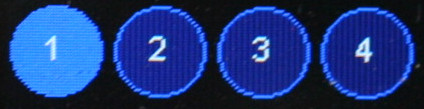
This object groups a set of buttons at different locations. When a button is pressed, it becomes highlighted and remains so until another button in the set is pressed. A callback runs each time the current button is changed.
Constructor positional arguments:
highlightColor to use for the highlighted button. Mandatory.callbackCallback when a new button is pressed. Default does nothing.selectedIndex of initial button to be highlighted. Default 0.
Methods:
add_buttonAdds a button. Arguments: as per theButtonconstructor. Returns the Button instance.greyed_outOptional Boolean argumentval=None. IfNonereturns the current 'greyed out' status of the control. Otherwise enables or disables it, showing it in its new state.valueOptional argument: a button in the set. If supplied, and the button is not currently active, the supplied button receives the focus and its callback is run. Always returns the currently active button.
Typical usage:
def callback(button, arg):
    print(arg)

table = [
    {'text' : '1', 'args' : ['1']},
    {'text' : '2', 'args' : ['2']},
    {'text' : '3', 'args' : ['3']},
    {'text' : '4', 'args' : ['4']},
]
col = 0
rb = RadioButtons(BLUE, callback) # color of selected button
for t in table:
    rb.add_button(wri, 10, col, textcolor = WHITE,
                  fgcolor = LIGHTBLUE, height = 40, **t)
    col += 60 # Horizontal row of buttons
Contents
6.7 Listbox widget
from gui.widgets import Listbox # File: listbox.py
A listbox with the second item highlighted. Pressing the physical select
button will cause the callback to run.
A Listbox is an active widget. By default its height is determined by the
number of entries in it and the font in use. It may be reduced by specifying
dlines in which case scrolling will occur. When the widget has focus the
currently selected element may be changed using increase and decrease
buttons or by turning the encoder. On pressing select a callback runs.
Constructor mandatory positional args:
writerTheWriterinstance (defines font) to use.rowLocation on screen.col
Mandatory keyword only argument:
elementsA list or tuple of strings to display. Must have at least one entry. An alternative format is described below which enables each item in the list to have a separate callback.
Optional keyword only arguments:
dlines=NoneBy default the height of the control is determined by the number of elements. If an integer < number of elements is passed the list will show that number of lines; its height will correspond. Scrolling will occur to ensure that the current element is always visible. To indicate when scrolling is possible, one or two vertical bars will appear to the right of the list.width=NoneControl width in pixels. By default this is calculated to accommodate all elements. If awidthis specified, and some elements are too long to fit, they will be clipped. This is a visual effect only and does not affect the value of that element.value=0Index of currently selected list item. If necessary the list will scroll to ensure the item is visible.fgcolor=NoneColor of foreground (the control itself). IfNonetheWriterforeground default is used.bgcolor=NoneBackground color of object. IfNonetheWriterbackground default is used.bdcolor=FalseColor of border. IfFalseno border will be drawn. If a color is provided, a border line will be drawn around the control.fontcolor=NoneText color. Defaults to system text color.select_color=DARKBLUEBackground color for selected item in list.callback=dolittleCallback function which runs whenselectis pressed.args=[]A list/tuple of arguments for above callback.also=0Options areListbox.ON_MOVEorListbox.ON_LEAVE. By default the callback runs only when theselectbutton is pressed. TheON_LEAVEvalue causes it also to run when the focus moves from the control if the currently selected element has changed. TheON_MOVEarg causes the callback to run every time the highlighted element is changed.
Methods:
greyed_outOptional Boolean argumentval=None. IfNonereturns the current 'greyed out' status of the control. Otherwise enables or disables it, showing it in its new state.valueArgumentval=None. If a provided argument is a valid index for the list, that entry becomes current and the callback is executed. Always returns the index of the currently active entry.textvalueArgumenttext=None. If a string argument is provided and is in the control's list, that item becomes current. Normally returns the current string. If a provided arg did not match any list item, the control's state is not changed andNoneis returned.
The callback's first argument is the listbox instance followed by any args
specified to the constructor. The currently selected item may be retrieved by
means of the instance's value or textvalue methods.
Alternative approach
By default the Listbox runs a common callback regardless of the item chosen.
This can be changed by specifying elements such that each element comprises a
3-list or 3-tuple with the following contents:
- String to display.
- Callback.
- Tuple of args (may be
()).
In this case constructor args callback and args must not be supplied. Args
received by the callback functions comprise the Listbox instance followed by
any supplied args. The following is a complete example (minus initial import
statements).
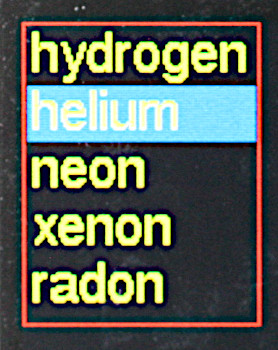
class BaseScreen(Screen):
    def __init__(self):
        def cb(lb, s):
            print('Callback', s)

        def cb_radon(lb, s):
            print('Radioactive', s)

        super().__init__()
        wri = CWriter(ssd, freesans20, GREEN, BLACK, verbose=False)
        els = (('Hydrogen', cb, ('H2',)),
               ('Helium', cb, ('He',)),
               ('Neon', cb, ('Ne',)),
               ('Xenon', cb, ('Xe',)),
               ('Radon', cb_radon, ('Ra',)))
        Listbox(wri, 2, 2, elements = els, bdcolor=RED)
        CloseButton(wri)

Screen.change(BaseScreen)
Contents
6.8 Dropdown widget
from gui.widgets import Dropdown # File: dropdown.py
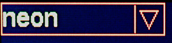
Closed dropdown list.
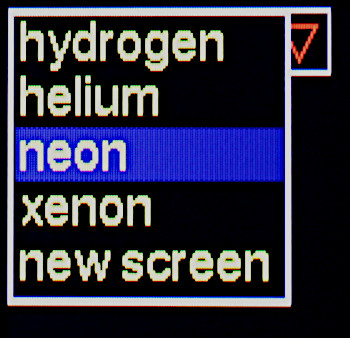
Open dropdown list. When closed, hidden items below are refreshed.
A dropdown list. The list, when active, is drawn over the control. The height
of the control is determined by the height of the font in use. By default the
height of the list is determined by the number of entries in it and the font in
use. It may be reduced by specifying dlines in which case scrolling will
occur. The dropdown should be placed high enough on the screen to ensure that
the list can be displayed.
Constructor mandatory positional args:
writerTheWriterinstance (defines font) to use.rowLocation on screen.col
Mandatory keyword only argument:
elementsA list or tuple of strings to display. Must have at least one entry. See below for an alternative way to use theDropdownwhich enables each item on the dropdown list to have a separate callback.
Optional keyword only arguments:
dlines=NoneBy default the height of the dropdown list is determined by the number of elements. If an integer < number of elements is passed the list will show that number of lines; its height will correspond. Scrolling will occur to ensure that the current element is always visible. To indicate when scrolling is possible, one or two vertical bars will appear to the right of the list.width=NoneControl width in pixels. By default this is calculated to accommodate all elements.value=0Index of currently selected list item.fgcolor=NoneColor of foreground (the control itself). IfNonetheWriterforeground default is used.bgcolor=NoneBackground color of object. IfNonetheWriterbackground default is used.bdcolor=FalseColor of border. IfFalseno border will be drawn. If a color is provided, a border line will be drawn around the control.fontcolor=NoneText color. Defaults to foreground color.select_color=DARKBLUEBackground color for selected item in list.callback=dolittleCallback function which runs when a list entry is picked.args=[]A list/tuple of arguments for above callback.
Methods:
greyed_outOptional Boolean argumentval=None. IfNonereturns the current 'greyed out' status of the control. Otherwise enables or disables it, showing it in its new state.valueArgumentval=None. If a provided arg is a valid index into the list, that entry becomes current and the callback is executed. Always returns the index of the currently active entry.textvalueArgumenttext=None. If a string argument is provided and is in the control's list, that item becomes current. Normally returns the current string. If a provided arg did not match any list item, the control's state is not changed andNoneis returned.
If select is pressed when the Dropdown has focus, the list is displayed.
The increase and decrease buttons move the list currency. If select is
pressed after changing the currency the callback is triggered, the list is
closed and the control will display the newly selected entry. If next or
prev are pressed while the list is open, focus will move to the next widget.
In this event the list will close and no selection change will be recognised:
the control will show the element which was visible at the start and the
callback will not run. Moving the focus is a means of cancelling any changes.
The callback's first argument is the dropdown instance followed by any args
specified to the constructor. The currently selected item may be retrieved by
means of the instance's value or textvalue methods.
Alternative approach
By default the Dropdown runs a single callback regardless of the element
chosen. This can be changed by specifying elements such that each element
comprises a 3-list or 3-tuple with the following contents:
- String to display.
- Callback.
- Tuple of args (may be
()).
In this case constructor args callback and args must not be supplied. Args
received by the callback functions comprise the Dropdown instance followed by
any supplied args. The following is a complete example (minus initial import
statements):
class BaseScreen(Screen):
    def __init__(self):
        def cb(dd, arg):
            print('Gas', arg)

        def cb_radon(dd, arg):
            print('Radioactive', arg)

        super().__init__()
        wri = CWriter(ssd, freesans20, GREEN, BLACK, verbose=False)
        els = (('hydrogen', cb, ('H2',)),
               ('helium', cb, ('He',)),
               ('neon', cb, ('Ne',)),
               ('xenon', cb, ('Xe',)),
               ('radon', cb_radon, ('Ra',)))
        Dropdown(wri, 2, 2, elements = els,
                bdcolor = RED, fgcolor=RED, fontcolor = YELLOW)
        CloseButton(wri)


Screen.change(BaseScreen)
Contents
6.9 DialogBox class
from gui.widgets import DialogBox # File: dialog.py
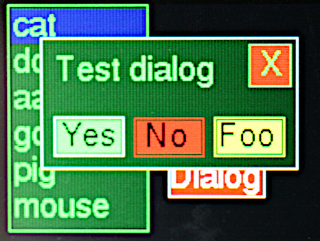
An active dialog box. Auto generated dialogs contain only pushbutton
instances, but user created dialogs may contain any widget.
This implements a modal dialog box based on a horizontal row of pushbuttons. Any button press will close the dialog. The caller can determine which button was pressed. The size of the buttons and the width of the dialog box are calculated from the strings assigned to the buttons. This ensures that buttons are evenly spaced and identically sized. Typically used for simple queries such as "yes/no/cancel".
Constructor positional args:
writerTheWriterinstance (defines font) to use.row=20Location on screen.col=20
Mandatory keyword only arg:
elementsA list or tuple of 2-tuples. Each defines the text and color of a pushbutton, e.g.(('Yes', RED), ('No', GREEN)).
Optional keyword only args:
label=NoneText for an optional label displayed in the centre of the dialog box.bgcolor=DARKGREENBackground color of window.buttonwidth=25Minimum width of buttons. In general button dimensions are calculated from the size of the strings inelements.closebutton=TrueIf set, aclosebutton will be displayed at the top RH corner of the dialog box.callback=dolittleargs=[]
Classmethod (inherited from Screen):
value(cls, val=None)Thevalarg can be any Python type.
The DialogBox is a Screen subclass. Pressing any button closes the dialog
and sets the Screen value to the text of the button pressed or "Close" in the
case of the close button. The outcome can therefore be tested by running
Screen.value() or by implementing the callback. The latter receives the
DialogBox instance as a first arg, followed by any args supplied to the
constructor.
Note that dialog boxes can also be constructed manually, enabling more flexible
designs. For example these might have widgets other than pushbuttons. The
approach is to write a user subclass of Window. Example code may be found
in gui/demos/screens.py.
Contents
6.10 Textbox widget
from gui.widgets import Textbox # File: textbox.py
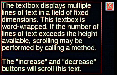
Displays multiple lines of text in a field of fixed dimensions. Text may be
clipped to the width of the control or may be word-wrapped. If the number of
lines of text exceeds the height available, scrolling will occur. Access to
text that has scrolled out of view may be achieved by calling a method. If the
widget is instantiated as active scrolling may be performed using the
increase and decrease buttons. The widget supports fixed and variable pitch
fonts.
Constructor mandatory positional arguments:
writerTheWriterinstance (font and screen) to use.rowLocation on screen.colwidthWidth of the object in pixels.nlinesNumber of lines of text to display. The object's height is determined from the height of the font:
height in pixels = nlines*font_height
As per all widgets the border is drawn two pixels beyond the control's boundary.
Keyword only arguments:
fgcolor=NoneColor of foreground (the control itself). IfNonetheWriterforeground default is used.bgcolor=NoneBackground color of object. IfNonetheWriterbackground default is used.bdcolor=FalseColor of border. IfFalseno border will be drawn. If a color is provided, a border line will be drawn around the control.clip=TrueBy default lines too long to display are right clipped. IfFalseis passed, word-wrap is attempted. If the line contains no spaces it will be wrapped at the right edge of the window.active=FalseIfTruescrolling may be performed via theincreaseanddecreasebuttons.
Methods:
appendArgss, ntrim=None, line=NoneAppend the stringsto the display and scroll up as required to show it. By default only the number of lines which will fit on screen are retained. If an integerntrim=Nis passed, only the last N lines are retained;ntrimmay be greater than can be shown in the control, hidden lines being accessed by scrolling.
If an integer (typically 0) is passed inlinethe display will scroll to show that line.scrollArgnNumber of lines to scroll. A negative number scrolls up. If scrolling would achieve nothing because there are no extra lines to display, nothing will happen. ReturnsTrueif scrolling occurred, otherwiseFalse.valueNo args. Returns the number of lines of text stored in the widget.clearNo args. Clears all lines from the widget and refreshes the display.gotoArgline=NoneFast scroll to a line. By default shows the end of the text. 0 shows the start.
Fast updates:
Rendering text to the screen is relatively slow. To send a large amount of text
the fastest way is to perform a single append. Text may contain newline
('\n') characters as required. In that way rendering occurs once only.
ntrim__
If text is regularly appended to a Textbox its buffer grows, using RAM. The
value of ntrim sets a limit to the number of lines which are retained, with
the oldest (topmost) being discarded as required.
Contents
6.11 Meter widget
This passive widget displays a single floating point value on a vertical
linear scale. Optionally it can support data dependent callbacks.
from gui.widgets import Meter # File: meter.py
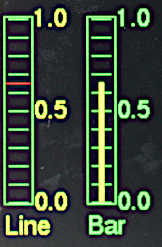 The two styles of
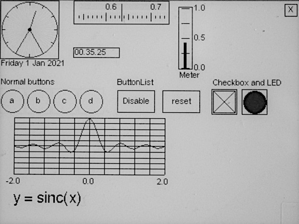
 meter, both showing a value of 0.65. This passive widget
provides a vertical linear meter display of values scaled between 0.0 and 1.0.
In these examples each meter simply displays a data value.
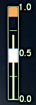
This example has two data sensitive regions, a control region with hysteresis
and an alarm region. Callbacks can run in response to specific changes in the
Meter's value emulating data-dependent behaviour including alarms and
controls (like thermostats) having hysteresis.
The class supports one or more Region instances. Visually these appear as
colored bands on the scale. If the meter's value enters, leaves or crosses one
of these bands a callback is triggered. This receives an arg indicating the
nature of the change which caused the trigger. For example an alarm might be
triggered when the value, initially below the region, enters it or crosses it.
The alarm might be cleared on exit or if crossed from above. Hysteresis as used
in thermostats is simple to implement. Examples of these techniques may be
found in gui.demos.tstat.py.
Regions may be modified, added or removed programmatically.
Constructor mandatory positional args:
writerTheWriterinstance (defines font) to use.rowLocation on screen.col
Keyword only args:
height=50Height of meter.width=10Width.fgcolor=NoneColor of foreground (the control itself). IfNonetheWriterforeground default is used.bgcolor=BLACKBackground color of meter. IfNonetheWriterbackground is used.bdcolor=FalseColor of border. IfFalseno border will be drawn. If a color is provided, a border line will be drawn around the control.ptcolor=NoneColor of meter pointer or bar. Default is foreground color.divisions=5No. of graduations to show.label=NoneA text string will cause aLabelto be drawn below the meter. An integer will create aLabelof that width for later use.style=Meter.LINEThe pointer is a horizontal line.Meter.BARcauses a vertical bar to be displayed. Much easier to read on monochrome displays.legends=NoneIf a tuple of strings is passed,Labelinstances will be displayed to the right hand side of the meter, starting at the bottom. E.G.('0.0', '0.5', '1.0')value=0Initial value.
Methods:
valueArgs:n=None, color=None.nshould be a float in range 0 to 1.0. Causes the meter to be updated. Out of range values are constrained. IfNoneis passed the meter is not updated.colorUpdates the color of the bar or line if a value is also passed.Nonecauses no change.
Returns the current value.
textUpdates the label if present (otherwise throws aValueError). Args:text=NoneThe text to display. IfNonedisplays last value.invert=FalseIf true, show inverse text.fgcolor=NoneForeground color: ifNonetheWriterdefault is used.bgcolor=NoneBackground color, as per foreground.bdcolor=NoneBorder color. As per above except that ifFalseis passed, no border is displayed. This clears a previously drawn border.
del_regionArg: aRegioninstance. Deletes the region. No callback will run.
Legends
Depending on the font in use for legends additional space may be required above
and below the Meter to display the top and bottom legends.
Example of use of Regions
# Instantiate Meter
ts = Meter(wri, row, sl.mcol + 5, ptcolor=YELLOW, height=100, width=15,
           style=Meter.BAR, legends=('0.0', '0.5', '1.0'))
# Instantiate two Regions and associate with the Meter instance.
reg = Region(ts, 0.4, 0.55, MAGENTA, ts_cb)
al = Region(ts, 0.9, 1.0, RED, al_cb)
The callback ts_cb will run in response to data values between 0.4 and 0.55:
if the value enters that range having been outside it, if it leaves the range,
or if successive values are either side of the range. The al_cb callback
behaves similarly for data values between 0.9 and 1.0.
Contents
6.11.1 Region class
from gui.widgets import Region # File: region.py
Instantiating a Region associates it with a supporting widget (currently only
a Meter). Constructor positional args are as follows:
tstatThe parent instance.vloLow value (0 <=vlo<= 1.0).vhiHigh value (vlo<vhi<= 1.0).colorFor visible band.callbackThis receives two args,regbeing theRegioninstance andreason, an integer indicating why the callback occurred (see below).args=()Optional additional tuple of positional args for the callback.
Method:
adjustArgs:vlo,vhi. Change the range of theRegion. Constraints are as per the above constructor args.
Class variables (constants).
These define the reasons why a callback occurred. A change in the Tstat value
or an adjustment of the Region values can trigger a callback. The value might
change such that it enters or exits the region. Alternatively it might change
from being below the region to above it: this is described as a transit. The
following cover all possible options.
EX_WB_IAExit region. Was below before it entered. Is now above.EX_WB_IBExit, was below, is below.EX_WA_IAExit, was above, is above.EX_WA_IBExit, was above, is below.T_IATransit, is above (was below by definition of a transit).T_IBTransit, is below.EN_WAEntry, was above.EN_WBEntry, was below.
The following, taken from gui.demos.tstat.py is an example of a thermostat
callback with hysteresis:
    def ts_cb(self, reg, reason):
        # Turn on if T drops below low threshold when it had been above high threshold. Or
        # in the case of a low going drop so fast it never registered as being within bounds
        if reason == reg.EX_WA_IB or reason == reg.T_IB:
            self.led.value(True)
        elif reason == reg.EX_WB_IA or reason == reg.T_IA:
            self.led.value(False)
Values for these constants enable them to be combined with the bitwise or
operator if you prefer that coding style:
if reason & (reg.EX_WA_IB | reg.T_IB): # Leaving region heading down
On instantiation of a Region callbacks do not run. The desirability of this
is application dependent. If the user Screen is provided with an after_open
method, this can be used to assign a value to the Tstat to cause region
callbacks to run as appropriate.
Contents
6.12 Slider and HorizSlider widgets
from gui.widgets import Slider, HorizSlider # File: sliders.py
Different styles of slider.
These emulate linear potentiometers in order to display or control floating
point values. A description of the user interface in the active case may be
found in Floating Point Widgets.
Vertical Slider and horizontal HorizSlider variants are available. These
are constructed and used similarly. The short forms (v) or (h) are used below
to identify these variants.
Constructor mandatory positional args:
writerTheWriterinstance (defines font) to use.rowLocation on screen.col
Optional keyword only arguments:
heightDimension of the bounding box. Default 100 pixels (v), 20 (h).widthDimension of the bounding box. Default 20 pixels (v), 100 (h).divisions=10Number of graduations on the scale.legends=NoneA tuple of strings to display near the slider. These will be distributed evenly along its length, starting at the bottom (v) or left (h).fgcolor=NoneColor of foreground (the control itself). IfNonetheWriterforeground default is used.bgcolor=NoneBackground color of object. IfNonetheWriterbackground default is used.fontcolor=NoneText color. Defaults to foreground color.bdcolor=FalseColor of border. IfFalseno border will be drawn. If a color is provided, a border line will be drawn around the control.slotcolor=NoneColor for the slot: this is a thin rectangular region in the centre of the control along which the slider moves. Defaults to the background color.prcolor=NoneIfactive, in precision mode the white focus border changes to yellow to for a visual indication. An alternative color can be provided.WHITEwill defeat this change.callback=dolittleCallback function which runs whenever the control's value changes. If the control isactiveit also runs on instantiation. This enables dynamic color changes. Default is a null function.args=[]A list/tuple of arguments for above callback.value=0.0The initial value: slider will be at the bottom (v), left (h).active=TrueDetermines whether the control can accept user input.min_delta=0.01Minimim value incrementmax_delta=0.1Maximum value increment (long button presses)
Methods:
greyed_outOptional Boolean argumentval=None. IfNonereturns the current 'greyed out' status of the control. Otherwise enables or disables it, showing it in its new state.value=NoneOptional float argument. If supplied the slider moves to show the new value and the callback is triggered. The method constrains the range to 0.0 to 1.0. The method always returns the control's value.colorMandatory argcolorThe control is rendered in the selected color. This supports dynamic color changes.
If instantiated as active, the floating point widget behaves as per
section 1.12. When the widget has
focus, increase and decrease buttons adjust the value. Brief presses cause
small changes, longer presses cause accelerating change. A long press of
select invokes high precision mode.
Callback
The callback receives an initial arg being the widget instance followed by any
user supplied args. The callback can be a bound method, typically of a Screen
subclass. The callback runs when the widget is instantiated and whenever the
value changes. This enables dynamic color change. See gui/demos/active.py.
Legends
Depending on the font in use for legends additional space may be required around sliders to display all legends.
Contents
6.13 Scale widget
from gui.widgets import Scale # File: scale.py
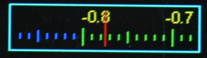
This displays floating point data having a wide dynamic range, and optionally provides for user input of such values. It is modelled on old radios where a large scale scrolls past a small window having a fixed pointer. This enables a scale with (say) 200 graduations (ticks) to readily be visible on a small display, with sufficient resolution to enable the user to interpolate between ticks. Default settings enable estimation of a value to within about +-0.1%.
The Scale may be active or passive. A description of the user interface
in the active case may be found in
Floating Point Widgets.
The scale handles floats in range -1.0 <= V <= 1.0, however data values may
be scaled to match any given range.
Legends for the scale are created dynamically as it scrolls past the window.
The user may control this by means of a callback. Example code may be found
in nano-gui
which has a Scale whose value range is 88.0 to 108.0. A callback ensures that
the display legends match the user variable. A further callback can enable the
scale's color to change over its length or in response to other circumstances.
Constructor mandatory positional args:
writerTheWriterinstance (defines font) to use.rowLocation on screen.col
Optional keyword only arguments:
ticks=200Number of "tick" divisions on scale. Must be divisible by 2.value=0.0Initial value.height=0Default is a minimum height based on the font height.width=100fgcolor=NoneColor of foreground (the control itself). IfNonetheWriterforeground default is used.bgcolor=NoneBackground color of object. IfNonetheWriterbackground default is used.bdcolor=NoneColor of border, defaultfgcolor. IfFalseno border will be drawn. If a color is provided, a border line will be drawn around the control.prcolor=NoneIfactive, in precision mode the white focus border changes to yellow to for a visual indication. An alternative color can be provided.WHITEwill defeat this change.pointercolor=NoneColor of pointer. Defaults to.fgcolor.fontcolor=NoneColor of legends. Defaultfgcolor.legendcb=NoneCallback for populating scale legends (see below).tickcb=NoneCallback for setting tick colors (see below).callback=dolittleCallback function which runs when the user moves the scale or the value is changed programmatically. If the control isactiveit also runs on instantiation. Default is a null function.args=[]A list/tuple of arguments for above callback.active=FalseBy default the widget is passive. By settingactive=Truethe widget can acquire focus; its value can then be adjusted with theincreaseanddecreasebuttons.
Methods:
greyed_outOptional Boolean argumentval=None. IfNonereturns the current 'greyed out' status of the control. Otherwise enables or disables it, showing it in its new state.value=NoneSet or get the current value. Always returns the current value. A passedfloatis constrained to the range -1.0 <= V <= 1.0 and becomes theScale's current value. TheScaleis updated. PassingNoneenables reading the current value, but see note below on precision.
For example code see gui/demos/active.py.
Control algorithm
If instantiated as active, the floating point widget behaves as per
section 1.12. When the widget has
focus, increase and decrease buttons adjust the value. Brief presses cause
small changes, longer presses cause accelerating change. A long press of
select invokes high precision mode.
Callback
The callback receives an initial arg being the widget instance followed by any
user supplied args. The callback can be a bound method, typically of a Screen
subclass. The callback runs when the widget is instantiated and whenever the
value changes. This enables dynamic color change.
Callback legendcb
The display window contains 20 ticks comprising two divisions; by default a
division covers a range of 0.1. A division has a legend at the start and end
whose text is defined by the legendcb callback. If no user callback is
supplied, legends will be of the form 0.3, 0.4 etc. User code may override
these to cope with cases where a user variable is mapped onto the control's
range. The callback takes a single float arg which is the value of the tick
(in range -1.0 <= v <= 1.0). It must return a text string. An example from
ths nano-gui demo
shows FM radio frequencies:
def legendcb(f):
    return '{:2.0f}'.format(88 + ((f + 1) / 2) * (108 - 88))
The above arithmetic aims to show the logic. It can (obviously) be simplified.
Callback tickcb
This callback enables the tick color to be changed dynamically. For example a
scale might change from green to orange, then to red as it nears the extremes.
The callback takes two args, being the value of the tick (in range
-1.0 <= v <= 1.0) and the default color. It must return a color. This example
is taken from the scale.py demo:
def tickcb(f, c):
    if f > 0.8:
        return RED
    if f < -0.8:
        return BLUE
    return c
Increasing the ticks value
This increases the precision of the display.
It does this by lengthening the scale while keeping the window the same size,
with 20 ticks displayed. If the scale becomes 10x longer, the value diference
between consecutive large ticks and legends is divided by 10. This means that
the tickcb callback must return a string having an additional significant
digit. If this is not done, consecutive legends will have the same value.
Precision
For performance reasons the control stores values as integers. This means that
if you set value and subsequently retrieve it, there may be some loss of
precision. Each visible division on the control represents 10 integer units.
Contents
6.14 ScaleLog widget
from gui.widgets import ScaleLog # File: scale_log.py
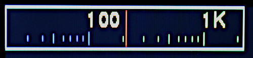
This displays floating point values with extremely wide dynamic range and
optionally enables their input. The dynamic range is handled by means of a base
10 logarithmic scale. In other respects the concept is that of the Scale
class.
The control is modelled on old radios where a large scale scrolls past a small window having a fixed pointer. The use of a logarithmic scale enables the value to span a range of multiple orders of magnitude.
The Scale may be active or passive. A description of the user interface
in the active case may be found in
Floating Point Widgets. Owing to the
logarithmic nature of the widget, the changes discussed in that reference are
multiplicative rather than additive. Thus a long press of increase will
multiply the widget's value by a progressively larger factor, enabling many
decades to be traversed quickly.
Legends for the scale are created dynamically as it scrolls past the window,
with one legend for each decade. The user may control this by means of a
callback, for example to display units, e.g. 10MHz. A further callback
enables the scale's color to change over its length or in response to other
circumstances.
The scale displays floats in range 1.0 <= V <= 10**decades where decades is
a constructor arg. The user may readily scale these so that a control having a
range of 1-10,000 controls a user value from 1e-6 to 1e-2 while displaying
ticks labelled 1μs, 10μs, 100μs, 1ms and 10ms.
Constructor mandatory positional args:
writerTheWriterinstance (defines font) to use.rowLocation on screen.col
Keyword only arguments (all optional):
decades=5Defines the control's maximum value (i.e.10**decades).value=1.0Initial value for control. Will be constrained to1.0 <= value <= 10**decadesif outside this range.height=0Default is a minimum height based on the font height.width=160fgcolor=NoneColor of foreground (the control itself). IfNonetheWriterforeground default is used.bgcolor=NoneBackground color of object. IfNonetheWriterbackground default is used.bdcolor=NoneColor of border, defaultfgcolor. IfFalseno border will be drawn. If a color is provided, a border line will be drawn around the control.prcolor=NoneIfactive, in precision mode the white focus border changes to yellow to for a visual indication. An alternative color can be provided.WHITEwill defeat this change.pointercolor=NoneColor of pointer. Defaults to.fgcolor.fontcolor=NoneColor of legends. DefaultWHITE.legendcb=NoneCallback for populating scale legends (see below).tickcb=NoneCallback for setting tick colors (see below).callback=dolittleCallback function which runs when the user moves the scale or the value is changed programmatically. If the control isactiveit also runs on instantiation. Default is a null function.args=[]A list/tuple of arguments for above callback. The callback's arguments are theScaleLoginstance, followed by any user supplied args.delta=0.01This determines the smallest amount of change which can be achieved with a brief button press. See Control Algorithm below.active=FalseDetermines whether the widget accepts user input.
Methods:
value=NoneSet or get the current value. Always returns the current value. A passedfloatis constrained to the range1.0 <= V <= 10**decadesand becomes the control's current value. TheScaleLogis updated. Always returns the control's current value.greyed_outOptional Boolean argumentval=None. IfNonereturns the current 'greyed out' status of the control. Otherwise enables or disables it, showing it in its new state.
Class variable:
encoder_rate=5If the hardware uses an encoder, this determines the rate of change when the value is adjusted. Increase to raise the rate.
For example code see gui/demos/active.py.
Control algorithm
If instantiated as active, the floating point widget behaves as per
section 1.12. When the widget has
focus, increase and decrease buttons adjust the value. Brief presses cause
small changes, longer presses cause accelerating change. A long press of
select invokes high precision mode.
In normal mode, the amount of change caused by a brief button press is
controlled by the constructor arg delta; the choice of this value represents
a compromise between precision and usability.
Owing to the logarithmic nature of the control, a small positive change is
defined by multiplication of the value by (1 + delta) and a negative change
corresponds to division by (1 + delta). In precision mode delta is
reduced by a factor of 10.
Callback
The callback receives an initial arg being the widget instance followed by any
user supplied args. The callback can be a bound method, typically of a Screen
subclass. The callback runs when the widget is instantiated and whenever the
value changes. This enables dynamic color change.
Callback legendcb
The start of each decade is marked by a long "tick" with a user-definable text
label. By default it will display a number corresponding to the value at that
tick (of form 10**n where n is an integer), but this can be overridden to
display values such as "10MHz". The following is a simple example from the
scale_ctrl_test demo:
def legendcb(f):
    if f < 999:
        return '{:<1.0f}'.format(f)
    return '{:<1.0f}K'.format(f/1000)
Callback tickcb
This callback enables the tick color to be changed dynamically. For example a
scale might change from green to orange, then to red as it nears the extremes.
The callback takes two args, being the value of the tick (of form 10**n where
n is an integer) and the default color. It must return a color. This example
is taken from the scale_ctrl_test demo:
def tickcb(f, c):
    if f > 30000:
        return RED
    if f < 10:
        return BLUE
    return c
Contents
6.15 Dial widget
from gui.widgets import Dial, Pointer # File: dial.py
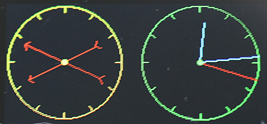
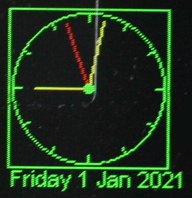
A Dial is a passive widget. It presents a circular display capable of
displaying an arbitrary number of vectors; each vector is represented by a
Pointer instance. The format of the display may be chosen to resemble an
analog clock or a compass. In the CLOCK case a pointer resembles a clock's
hand extending from the centre towards the periphery. In the COMPASS case
pointers are chevrons extending equally either side of the circle centre.
In both cases the length, angle and color of each Pointer may be changed
dynamically. A Dial can include an optional Label at the bottom which may
be used to display any required text.
In use, a Dial is instantiated. Then one or more Pointer objects are
instantiated and assigned to it. The Pointer.value method enables the Dial
to be updated affecting the length, angle and color of the Pointer.
Pointer values are complex numbers.
Dial class
Constructor mandatory positional args:
writerTheWriterinstance (defines font) to use.rowLocation on screen.col
Keyword only args:
height=100Height and width of dial.fgcolor=NoneColor of foreground (the control itself). IfNonetheWriterforeground default is used.bgcolor=NoneBackground color of object. IfNonetheWriterbackground default is used.bdcolor=FalseColor of border. IfFalseno border will be drawn. If a color is provided, a border line will be drawn around the control.ticks=4No. of gradutions to show.label=NoneA text string will cause aLabelto be drawn below the meter. An integer will create aLabelof that width for later use.style=Dial.CLOCKPointers are drawn from the centre of the circle as per the hands of a clock.Dial.COMPASScauses pointers to be drawn as arrows centred on the control's centre. Arrow tail chevrons are suppressed for very short pointers.pip=NoneDraws a central dot. A color may be passed, otherwise the foreground color will be used. IfFalseis passed, no pip will be drawn. The pip is suppressed if the shortest pointer would be hard to see.
Method:
textUpdates the label if present (otherwise throws aValueError). Args:text=NoneThe text to display. IfNonedisplays last value.invert=FalseIf true, show inverse text.fgcolor=NoneForeground color: ifNonetheWriterdefault is used.bgcolor=NoneBackground color, as per foreground.bdcolor=NoneBorder color. As per above except that ifFalseis passed, no border is displayed. This clears a previously drawn border.
When a Pointer is instantiated it is assigned to the Dial by the Pointer
constructor.
Pointer class
Constructor arg:
dialTheDialinstance on which it is to be dsplayed.
Methods:
valueArgs:v=NoneThe value is a complex number. A magnitude exceeding unity is reduced (preserving phase) to constrain thePointerwithin the unit circle.color=NoneBy default the pointer is rendered in the foreground color of the parentDial. Otherwise the passed color is used.
Returns the current value.
Typical usage:
from hardware_setup import ssd  # Create a display instance
import uasyncio as asyncio
import cmath
from gui.core.ugui import Screen
from gui.core.writer import CWriter
from gui.core.colors import *

from gui.widgets import Dial, Pointer, CloseButton
import gui.fonts.freesans20 as freesans20

async def run(dial):
    hrs = Pointer(dial)
    mins = Pointer(dial)
    hrs.value(0 + 0.7j, RED)
    mins.value(0 + 0.9j, YELLOW)
    dm = cmath.exp(-1j * cmath.pi / 30)  # Rotate by 1 minute
    dh = cmath.exp(-1j * cmath.pi / 1800)  # Rotate hours by 1 minute
    # Twiddle the hands: see vtest.py for an actual clock
    while True:
        await asyncio.sleep_ms(200)
        mins.value(mins.value() * dm, RED)
        hrs.value(hrs.value() * dh, YELLOW)

class BaseScreen(Screen):

    def __init__(self):
        super().__init__()
        wri = CWriter(ssd, freesans20, GREEN, BLACK, verbose=False)
        dial = Dial(wri, 5, 5, ticks = 12, bdcolor=None)
        self.reg_task(run(dial))
        CloseButton(wri)

Screen.change(BaseScreen)
Contents
6.16 Knob widget
from gui.widgets import Knob # File: knob.py
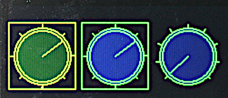
Rightmost example has no border and 270° travel. Others have 360°.
This emulates a rotary control capable of being rotated through a predefined
arc in order to display or set a floating point variable. A Knob may be
active or passive. A description of the user interface in the active case
may be found in Floating Point Widgets.
Constructor mandatory positional args:
writerTheWriterinstance (defines font) to use.rowLocation on screen.col
Optional keyword only arguments:
height=70Dimension of the square bounding box.arc=TWOPIMovement available. Default 2*PI radians (360 degrees). May be reduced, e.g. to provide a 270° range of movement.ticks=9Number of graduations around the dial.value=0.0Initial value. By default the knob will be at its most counter-clockwise position.fgcolor=NoneColor of foreground (the control itself). IfNonetheWriterforeground default is used.bgcolor=NoneBackground color of object. IfNonetheWriterbackground default is used.color=NoneFill color for the control knob. Default: no fill.bdcolor=FalseColor of border. IfFalseno border will be drawn. If a color is provided, a border line will be drawn around the control.prcolor=NoneIfactive, in precision mode the white focus border changes to yellow for a visual indication. An alternative color can be provided.WHITEdefeats this change;Falsedisables precision mode.callback=dolittleCallback function runs when the user moves the knob or the value is changed programmatically.args=[]A list/tuple of arguments for above callback.active=TrueEnable user input via theincreaseanddecreasebuttons.
Methods:
greyed_outOptional Boolean argumentval=None. IfNonereturns the current 'greyed out' status of the control. Otherwise enables or disables it, showing it in its new state.valueOptional argumentval. If set, adjusts the pointer to correspond to the new value. The move callback will run. The method constrains the range to 0.0 to 1.0. Always returns the control's value.
Callback
The callback receives an initial arg being the widget instance followed by any
user supplied args. The callback can be a bound method, typically of a Screen
subclass. The callback runs when the widget is instantiated and whenever the
value changes. This enables dynamic color change.
Contents
6.17 Adjuster widget
from gui.widgets import Adjuster, FloatAdj # File: adjuster.py
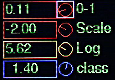
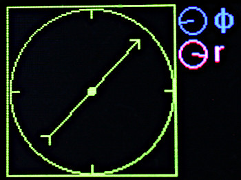
Four examples paired with Labels. An example of two Adjuster instances
setting a vector.
The Adjuster is a space saving version of the Knob. It is normally paired
with a Label which provides user feedback of the value. It has a range of
0.0 to 1.0 and a visual arc of 270°. User code can provide arbitrary scaling
or nonlinear operation. This is demonstrated in demos/adjuster.py. The
widget was inspired by discussions with the author of
this project.
Constructor mandatory positional args:
writerTheWriterinstance. This defines the control's height.rowLocation on screen.col
Optional keyword only arguments:
value=0.0Initial value. By default the knob will be at its most counter-clockwise position.fgcolor=NoneColor of foreground (the control itself). IfNonetheWriterforeground default is used.bgcolor=NoneBackground color of object. IfNonetheWriterbackground default is used.color=NoneFill color for the control knob. Default: no fill.prcolor=NoneIn precision mode the white focus border changes to yellow for a visual indication. An alternative color can be provided.WHITEdefeats the change;Falsedisables precision mode.callback=dolittleCallback function runs when the user moves the knob or the value is changed programmatically.args=[]A list/tuple of arguments for above callback.
Methods:
greyed_outOptional Boolean argumentval=None. IfNonereturns the current 'greyed out' status of the control. Otherwise enables or disables it, showing it in its new state.valueOptional argumentval. If set, adjusts the pointer to correspond to the new value. The move callback will run. The method constrains the range to 0.0 to 1.0. Always returns the control's value.
Callback
The callback receives an initial arg being the widget instance followed by any
user supplied args. The callback can be a bound method, typically of a Screen
subclass. The callback runs when the widget is instantiated and whenever the
value changes. Typically the callback will adjust the text displayed on a
linked label.
A numeric entry device
The file widgets/adjuster.py includes an example
class which combines an Adjuster with one or two Label instances. The
Adjuster changes the displayed value in the Label to its left. Its use is
illustrated in demos/adjuster.py. The class can be
used as a template for a user class, which may have a different layout on
screen. It supports arbitrary mapping and number formatting on a per-instance
basis. See code comments for further details.
Contents
6.18 Menu class
from gui.widgets import Menu # File: menu.py
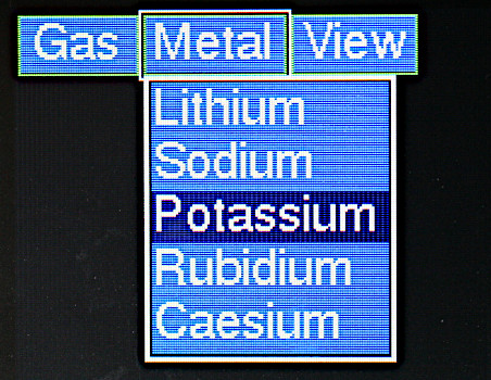
The Menu class enables the creation of single or multiple level menus. The
top level of the menu comprises a row of Button instances at the top of the
physical screen. Each button can either call a callback or instantiate a
dropdown menu comprising the second menu level.
Each item on a dropdown menu can invoke either a callback or a lower level menu.
Constructor mandatory positional arg:
writerTheWriterinstance (defines font) to use.
Keyword only args:
height=25Height of top level menu buttons.bgcolor=NoneBackground color of buttons and dropdown.fgcolor=NoneForeground color.textcolor=NoneText color.select_color=DARKBLUEBackground color of selected item on dropdown menu.argsThis should be a tuple containing a tuple of args for each entry in the top level menu. Each tuple should be of one of two forms:
(text, cb, (args,))A single-level entry: the top levelButtonwith texttextruns the callbackcbwith positional args defined by the supplied tuple (which may be()). The callback receives an initial arg being theButtoninstance.(text, (element0, element1,...))In this instance the top levelButtontriggers a dropdown menu defined by data in theelementstuple.
Each element in the elements tuple is a tuple defining a menu item. This can
take two forms, each of which has the text for the menu item as the first
value:
(text, cb, (args,))The element triggers callbackcbwith positional args defined by the supplied tuple (which may be()). The callback receives an initial arg being theListboxinstance which corresponds to the parent dropdown menu.(text, (elements,))This element triggers a submenu with a recursive instance ofelements.
The following (from gui/demos/menui.py) is complete apart from initial import
statements. It illustrates a 3-level menu.
class BaseScreen(Screen):

    def __init__(self):
        def cb(button, n):
            print('Help callback', n)

        def cb_sm(lb, n):
            print('Submenu callback', lb.value(), lb.textvalue(), n)

        super().__init__()
        metals2 = (('Gold', cb_sm, (10,)),
                   ('Silver', cb_sm, (11,)),
                   ('Iron', cb_sm, (12,)),
                   ('Zinc', cb_sm, (13,)),
                   ('Copper', cb_sm, (14,)))  # Level 3

        gases = (('Helium', cb_sm, (0,)),
                 ('Neon', cb_sm, (1,)),
                 ('Argon', cb_sm, (2,)),
                 ('Krypton', cb_sm, (3,)),
                 ('Xenon', cb_sm, (4,)),
                 ('Radon', cb_sm, (5,)))  # Level 2

        metals = (('Lithium', cb_sm, (6,)),
                  ('Sodium', cb_sm, (7,)),
                  ('Potassium', cb_sm, (8,)),
                  ('Rubidium', cb_sm, (9,)),
                  ('More', metals2))  # Level 2

        mnu = (('Gas', gases),
               ('Metal', metals),
               ('Help', cb, (2,)))  # Top level 1

        wri = CWriter(ssd, font, GREEN, BLACK, verbose=False)
        Menu(wri, bgcolor=BLUE, textcolor=WHITE, args = mnu)
        CloseButton(wri)

Screen.change(BaseScreen)
The code
        mnu = (('Gas', gases),
               ('Metal',metals),
               ('Help', cb, (2,)))
defines the top level, with the first two entries invoking submenus and the
third running a callback cb with 2 as an arg.
This produces a second level menu with one entry ('More') invoking a third
level (metals2):
        metals = (('Lithium', cb_sm, (6,)),
                  ('Sodium', cb_sm, (7,)),
                  ('Potassium', cb_sm, (8,)),
                  ('Rubidium', cb_sm, (9,)),
                  ('More', metals2))
The other entries all run cb_sm with a different arg. They could each run a
different callback if the application required it.
Contents
6.19 BitMap Widget
from gui.widgets import BitMap # File: bitmap.py
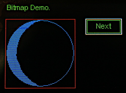
This renders a monochrome bitmap stored in a file to a rectangular region. The
bitmap file format is C source code generated by the Linux bitmap editor. The
bitmap may be rendered in any color. Data and colors can be changed at run time.
The widget is intended for larger bitmaps and is designed to minimise RAM usage
at cost of performance. For fast updates of smaller bitmaps consider using an
icon font.
Constructor mandatory positional args:
writerAWriterinstance.rowLocation on screen.colheightImage height in pixels. Dimensions must exactly match the image file.widthImage width in pixels.
Keyword only args:
fgcolor=NoneForeground (1) color of image.bgcolor=NoneBackground (0) color.bdcolor=REDBorder color.
Methods:__
valuemandatory argfnpath to an image file. Causes theBitMapimage to be updated from the file. Files should be stored on the root directory of the host. Blocks for a period depending on filesystem performance.colorargsfgcolor=None,bgcolor=None. Causes the image colors to be changed. The file will be re-read and the image updated.
Because of the use of file storage when an update occurs there will be a brief "dead time" when the GUI is unresponsive. This is not noticeable if the image is displayed when a screen initialises, or if it changes in response to a user action. Use in animations is questionable.
See gui/demos/bitmap.py for a usage example. Files must be copied from
gui/fonts/bitmaps/ to the root directory of the device.
Contents
6.20 QRMap Widget
from gui.widgets import QRMap # File: qrcode.py
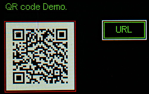
This renders QR codes generated using the uQR application. Images may be scaled to render them at larger sizes. Please see the notes below on performance and RAM usage.
Constructor positional args:
writerAWriterinstance.rowLocation on screen.colversion=4Defines the size of the image: see below.scale=1
Keyword only args:
bdcolor=REDBorder color.buf=NoneAllows use of a pre-allocated image buffer.
Methods:__
valuemandatory argtexta string for display as a QR code. This method can throw aValueErrorif the string cannot be accommodated in the chosen code size (i.e.version).__call__Synonym forvalue.
Static Method:__
make_bufferargsversion,scale. Returns a buffer big enough to hold the QR code bitmap. Use of this is optional: it is a solution if memory errors are encountered when instantiating aQRMap.
Note on image sizes. The size of a QR code bitmap depends on the version and
scale parameters according to this formula:
edge_length_in_pixels = (4 * version + 17) * scale
To this must be added a mandatory 4 pixel border around every edge. So the
height and width occupied on screen is:
dimension = (4 * version + 25) * scale
Performance
The uQR get_matrix() method blocks: in my testing for about 750ms. A QRMap
buffers the scaled matrix and renders it using bit blitting. Blocking by
QRMap methods is minimal; refreshing a screen with the same contents is fast.
The uQR library is large, and compiling it uses a substantial amount of RAM.
If memory errors are encountered try cross-compiling or the use of frozen byte
code.
See gui/demos/qrcode.py for a usage example. The demo expects uQR.py to be
located in the root directory of the target.
Contents
7. Graph Plotting
from gui.widgets.graph import PolarGraph, PolarCurve, CartesianGraph, Curve, TSequence
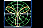
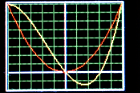
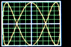
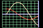 Realtime time sequence simulation.
For example code see gui/demos/plot.py.
7.1 Concepts
Data for Cartesian graphs constitutes a sequence of x, y pairs, for polar
graphs it is a sequence of complex z values. The module supports three
common cases:
- The dataset to be plotted is complete at the outset.
- Arbitrary data arrives gradually and needs to be plotted as it arrives.
- One or more
yvalues arrive gradually. TheXaxis represents time. This is a simplifying case of 2.
7.1.1 Graph classes
A user program first instantiates a graph object (PolarGraph or
CartesianGraph). This creates an empty graph image upon which one or more
curves may be plotted. Graphs are passive widgets so cannot accept user input.
7.1.2 Curve classes
The user program then instantiates one or more curves (Curve or
PolarCurve) as appropriate to the graph. Curves may be assigned colors to
distinguish them.
A curve is plotted by means of a user defined populate generator. This
assigns points to the curve in the order in which they are to be plotted. The
curve will be displayed on the graph as a sequence of straight line segments
between successive points.
Where it is required to plot realtime data as it arrives, this is achieved
via calls to the curve's point method. If a prior point exists it causes a
line to be drawn connecting the point to the last one drawn.
7.1.3 Coordinates
PolarGraph and CartesianGraph objects are subclassed from Widget and are
positioned accordingly by row and col with a 2-pixel outside border. The
coordinate system within a graph conforms to normal mathematical conventions.
Scaling is provided on Cartesian curves enabling user defined ranges for x and y values. Points lying outside of the defined range will produce lines which are clipped at the graph boundary.
Points on polar curves are defined as Python complex types and should lie
within the unit circle. Points which are out of range may be plotted beyond the
unit circle but will be clipped to the rectangular graph boundary.
Contents
7.2 Graph classes
7.2.1 Class CartesianGraph
Constructor.
Mandatory positional arguments:
writerACWriterinstance.rowPosition of the graph in screen coordinates.col
Keyword only arguments (all optional):
height=90Dimension of the bounding box.width=110Dimension of the bounding box.fgcolor=NoneColor of the axis lines. Defaults toWriterforeground color.bgcolor=NoneBackground color of graph. Defaults toWriterbackground.bdcolor=NoneBorder color. IfFalseno border is displayed. IfNonea border is shown in the foreground color. If a color is passed, it is used.gridcolor=NoneColor of grid. Default: Writer foreground color.xdivs=10Number of divisions (grid lines) on x axis.ydivs=10Number of divisions on y axis.xorigin=5Location of origin in terms of grid divisions.yorigin=5Asxorigin. The default of 5, 5 with 10 grid lines on each axis puts the origin at the centre of the graph. Settings of 0, 0 would be used to plot positive values only.
Method:
showNo args. Redraws the empty graph. Used when plotting time sequences.
7.2.2 Class PolarGraph
Constructor.
Mandatory positional arguments:
writerACWriterinstance.rowPosition of the graph in screen coordinates.col
Keyword only arguments (all optional):
height=90Dimension of the square bounding box.fgcolor=NoneColor of the axis lines. Defaults toWriterforeground color.bgcolor=NoneBackground color of graph. Defaults toWriterbackground.bdcolor=NoneBorder color. IfFalseno border is displayed. IfNonea border is shown in theWriterforeground color. If a color is passed, it is used.gridcolor=NoneColor of grid. Default: Writer foreground color.adivs=3Number of angle divisions per quadrant.rdivs=4Number radius divisions.
Method:
showNo args. Redraws the empty graph.
Contents
7.3 Curve classes
7.3.1 Class Curve
The Cartesian curve constructor takes the following positional arguments:
Mandatory arguments:
graphTheCartesianGraphinstance.colorIfNoneis passed, thegraphforeground color is used.
Optional arguments:
3. populate=None A generator to populate the curve. See below.
4. origin=(0,0) 2-tuple containing x and y values for the origin. Provides
for an optional shift of the data's origin.
5. excursion=(1,1) 2-tuple containing scaling values for x and y.
Methods:
pointArguments x, y. DefaultsNone. Adds a point to the curve. If a prior point exists a line will be drawn between it and the current point. If a point is out of range or if either arg isNoneno line will be drawn. Passing no args enables discontinuous curves to be plotted. This method is normally used for real time plotting.
The populate generator may take zero or more positional arguments. It should
repeatedly yield x, y values before returning. Where a curve is discontinuous
None, None may be yielded: this causes the line to stop. It is resumed when
the next valid x, y pair is yielded.
If populate is not provided the curve may be plotted by successive calls to
the point method. This may be of use where data points are acquired in real
time, and realtime plotting is required. See class RTRect in
gui/demos/plot.py.
Scaling
By default, with symmetrical axes, x and y values are assumed to lie between -1 and +1.
To plot x values from 1000 to 4000 we would set the origin x value to 1000
and the excursion x value to 3000. The excursion values scale the plotted
values to fit the corresponding axis.
7.3.2 Class PolarCurve
The constructor takes the following positional arguments:
Mandatory arguments:
graphThePolarGraphinstance.color
Optional arguments:
3. populate=None A generator to populate the curve. See below.
Methods:
pointArgumentz=None. Normally acomplex. Adds a point to the curve. If a prior point exists a line will be drawn between it and the current point. If the arg isNoneno line will be drawn. Passing no args enables discontinuous curves to be plotted. Lines are clipped at the square region bounded by (-1, -1) to (+1, +1).
The populate generator may take zero or more positional arguments. It should
yield a complex z value for each point before returning. Where a curve is
discontinuous a value of None may be yielded: this causes plotting to stop.
It is resumed when the next valid z point is yielded.
If populate is not provided the curve may be plotted by successive calls to
the point method. This may be of use where data points are acquired in real
time, and realtime plotting is required. See class RTPolar in
gui/demos/plot.py.
Scaling
Complex points should lie within the unit circle to be drawn within the grid.
Contents
7.4 Class TSequence
A common task is the acquisition and plotting of real time data against time, such as hourly temperature and air pressure readings. This class facilitates this. Time is on the x-axis with the most recent data on the right. Older points are plotted to the left until they reach the left hand edge when they are discarded. This is akin to old fashioned pen plotters where the pen was at the rightmost edge (corresponding to time now) with old values scrolling to the left with the time axis in the conventional direction.
The user instantiates a graph with the X origin at the right hand side and then
instantiates one or more TSequence objects. As each set of data arrives it is
appended to its TSequence using the add method. See the example below.
The constructor takes the following args:
Mandatory arguments:
graphTheCartesianGraphinstance.colorsizeInteger. The number of time samples to be plotted. See below.
Optional arguments:
4. yorigin=0 These args provide scaling of Y axis values as per the Curve
class.
5 yexc=1
Method:
addArgvthe value to be plotted. This should lie between -1 and +1 unless scaling is applied.
Note that there is little point in setting the size argument to a value
greater than the number of X-axis pixels on the graph. It will work but RAM
and execution time will be wasted: the constructor instantiates an array of
floats of this size.
Each time a data set arrives the graph should be cleared and a data value
is added to each TSequence instance. The following (slightly simplified) is
taken from gui/demos/plot.py and simulates the slow arrival of sinusoidal
values.
class TSeq(Screen):
    def __init__(self):
        super().__init__()
        self.g = CartesianGraph(wri, 2, 2, xorigin = 10, fgcolor=GREEN,
                                gridcolor=LIGHTGREEN, bdcolor=False)

    def after_open(self):  # After graph has been drawn
        self.reg_task(self.run(self.g), True)  # Cancel on screen change

    async def run(self, g):
        await asyncio.sleep_ms(0)
        tsy = TSequence(g, YELLOW, 50)
        tsr = TSequence(g, RED, 50)
        t = 0
        while True:
            g.show()  # Redraw the empty graph
            tsy.add(0.9*math.sin(t/10))
            tsr.add(0.4*math.cos(t/10))  # Plot the new curves
            await asyncio.sleep_ms(400)
            t += 1
Contents
8. ESP32 touch pads
On ESP32 physical buttons may be replaced with touch pads. Buttons and pads cannot be mixed, but it is possible to use three pads with an encoder.
The only change required to use touch pads is in hardware_setup.py. Pin
instances must be chosen from ones supporting the TouchPad class - see
official docs.
The Pin constructor may be called with a single arg being the pin number.
The following illustrates the end of a setup file for an application with five touchpads:
# Set up for display driver omitted
ssd = SSD(spi, pcs, pdc, prst)

from gui.core.ugui import Display, quiet
# quiet()
# Define control pins - no pullups.
nxt = Pin(13)  # Move to next control
sel = Pin(14)  # Operate current control
prev = Pin(15)  # Move to previous control
increase = Pin(33)  # Increase control's value
decrease = Pin(32)  # Decrease control's value
# Create a Display instance and assign to display.
display = Display(ssd, nxt, sel, prev, increase, decrease, False, 80)
The final two constructor args are:
encoder=FalseNo encoder being used in this example.touch=80Use touch interface with a threshold of 80%.
The touch value determines the level from machine.TouchPad.read() at which
a touch is determined to have occurred. In the above fragment a value of 80 is
passed. Assume the untouched value from TouchPad.read() is 1020. If a value
below 80% of 1020 = 816 is read, a touch is deemed to have occurred. Further
docs on pushbutton.py may be found
here.
9. Realtime applications
Screen refresh is performed in a continuous loop with yields to the scheduler.
In normal applications this works well, however a significant proportion of
processor time is spent performing a blocking refresh. A means of synchronising
refresh to other tasks is provided, enabling the application to control the
screen refresh. This is done by means of two Event instances. The refresh
task operates as below (code simplified to illustrate this mechanism).
class Screen:
    rfsh_start = Event()  # Refresh pauses until set (set by default).
    rfsh_done = Event()  # Flag a user task that a refresh was done.

    @classmethod
    async def auto_refresh(cls):
        cls.rfsh_start.set()
        while True:
            await cls.rfsh_start.wait()
            ssd.show()  # Synchronous (blocking) refresh.
            # Flag user code.
            cls.rfsh_done.set()
            await asyncio.sleep_ms(0)  # Let user code respond to event
By default the rfsh_start event is permanently set, allowing refresh to free
run. User code can clear this event to delay refresh. The rfsh_done event can
signal to user code that refresh is complete. As an example of simple usage,
the following, if awaited, pauses until a refresh is complete and prevents
another from occurring.
    async def refresh_and_stop(self):
        Screen.rfsh_start.set()  # Allow refresh
        Screen.rfsh_done.clear()  # Enable completion flag
        await Screen.rfsh_done.wait()  # Wait for a refresh to end
        Screen.rfsh_start.clear()  # Prevent another.
The demo gui/demos/audio.py provides example usage.
10 ePaper displays
In general ePaper displays do not work well with micro-gui because refresh is slow (seconds) and visually intrusive. Some displays support partial refresh which is faster (hundreds of ms) and non-intrusive. The penalty is "ghosting" where pixels which change from black to white do so imperfectly, leaving a grey trace behind. The degree of ghosting varies between display types.
The Waveshare pico_epaper_42 has quite a low level of ghosting. A full refresh takes about 2.1s and partial about 740ms. In use there is a visible lag between operating a user control and a visible response, but it is usable. Currently this is the only fully supported ePaper display.
It has a socket for a Pico or Pico W, but also comes with a cable suitable for
connecting to any host. The hardware_setup.py should be copied or adapted from
setup_examples/pico_epaper_42_pico.py. If using the socket, default args may
be used (see code comment).
Some attention to detail is required to handle the refresh characteristics. The application must wait for the initial full refresh (which occurs automatically) before putting the display into partial mode. This is done by the screen constructor issuing
asyncio.create_task(set_partial())
to run
async def set_partial():  # Ensure 1st refresh is a full refresh
    await Screen.rfsh_done.wait()  # Wait for first refresh to end
    ssd.set_partial()
The application then runs in partial mode with a reasonably quick and visually satisfactory response to user inputs such as button events. See the epaper demo.
It is likely that applications will provide a full refresh method to clear any
ghosting. The demo provides for a full refresh via the reset button. A full
refresh should be done as follows:
async def full_refresh():
    Screen.rfsh_done.clear()  # Enable completion flag
    await Screen.rfsh_done.wait()  # Wait for a refresh to end
    ssd.set_full()
    Screen.rfsh_done.clear()  # Re-enable completion flag
    await Screen.rfsh_done.wait()  # Wait for a single full refresh to end
    ssd.set_partial()  # Subsequent refreshes are partial
The driver for the supported display uses 1-bit color mapping: this means that
greying-out has no visible effect. Greyed-out controls cannot accept the focus
and are therefore disabled but appearance is unchanged. nano-gui has a 2-bit
driver which supports greyscales, but there is no partial support so this is
unsuitable for micro_gui.
Contents
Appendix 1 Application design
Tab order and button layout
The "tab order" of widgets on a Screen is the order with which they acquire
focus with successive presses of the Next button. It is determined by the
order in which they are instantiated. Tab order is important for usability but
instantiating in the best order can conflict with program logic. This happens
if a widget's callback refers to others not yet instantiated. See demos
dropdown.py and linked_sliders.py for one solution.
The obvious layout for the physical buttons is as per a joystick:
| Increase | ||
| Prev | Select | Next |
| Decrease |
This works well with many screen layouts, if the tab order is considered in the
layout of the screen. It works well with most widgets including vertical ones
such as the Slider. With horizontal widgets such as Scale controls it can
be counter intuitive because the horizontal layout does not match the position
of the increase and decrease buttons. A different physical layout may be
preferred.
The apparently obvious solution of designing a vertical Scale is tricky owing
to the fact that the length of the internal text can be substantial and
variable.
Encoder interface
This alternative interface comprises two buttons Next and Prev with an
an encoder such as this one. Selection
occurs when the knob is pressed, and movement when it is rotated. This can be
more intuitive, particularly with horizontally oriented controls.
This is the pinout of the Adafruit encoder as viewed from the top, with
connections to pins passed to the Display constructor as sel (select), up
(increase) and down (decrease).
| Left | Right |
|---|---|
| Increase | Gnd |
| Gnd | No pin |
| Decrease | Select |
If an encoder operates in the wrong direction, Increase and Decrease pins
should be transposed (physically or logically in hardware_setup.py).
Screen layout
Widgets are positioned using absolute row and col coordinates. These may
optionally be calculated using the metrics of other widgets. This facilitates
relative positioning which can make layouts easier to modify. Such layouts can
also automatically adapt to changes of fonts. To simplify this, all widgets
have the following bound variables, which should be considered read-only:
heightAs specified. Does not include border.widthDitto.mrowMaximum absolute row occupied by the widget (including border).mcolMaximum absolute col occupied by the widget (including border).
A further aid to metrics is the Writer method .stringlen(s). This takes a
string as its arg and returns its length in pixels when rendered using that
Writer instance's font.
The mrow and mcol values enable other widgets to be positioned relative to
the one previously instantiated. In the cases of sliders, Dial and Meter
widgets these take account of space ocupied by legends or labels.
The aclock.py and linked_sliders.py demos provide simple examples of this
approach.
Use of graphics primitives
See demo primitives.py.
These notes are for those wishing to draw directly to the Screen instance.
This is done by providing the user Screen class with an after_open() method
which is written to issue the display driver calls.
The following code instantiates two classes:
import hardware_setup  # Create a display instance
from gui.core.ugui import Screen, ssd, display
The ssd object is an instance of the object defined in the display driver. It
is a requirement that this is a subclass of framebuf.FrameBuffer. Hence ssd
supports all the graphics primitives provided by FrameBuffer. These may be
used to draw on the Screen.
The display object has methods with the same names and args as those of
ssd. These support greying out. So you can write (for example)
display.rect(10, 10, 50, 50, RED)
To render in the correct colors it is wise ensure that greying out is disabled
prior to calling display methods. This is done with
display.usegrey(False)
There is little point in issuing display.rect as it confers no advantage over
ssd.rect. However the Display class adds methods not currently available in
framebuf. These are listed below.
circle(self, x0, y0, r, color, width =1)Width specifies the line width.fillcircle(self, x0, y0, r, color)clip_rect(self, x, y, w, h, color)Rectangle with clipped corners.fill_clip_rect(self, x, y, w, h, color)print_left(self, writer, x, y, txt, fgcolor=None, bgcolor=None, invert=False)print_centred(self, writer, x, y, text, fgcolor=None, bgcolor=None, invert=False)
Hopefully these are self explanatory. The Display methods use the framebuf
convention of x, y coordinates rather than the row, col system used by
micro-gui.
The primitives.py demo provides a simple example.
Callbacks
Callback functions should execute quickly, otherwise screen refresh will not
occur until the callback is complete. Where a time consuming task is to be
triggered by a callback an asyncio task should be launched. In the following
sample an LED widget is to be cycled through various colors in response to
a callback.
def callback(self, button, val):
    self.reg_task(self.flash_led(), on_change=True)

async def flash_led(self):  # Will be cancelled if the screen ceases to be current
    self.led.color(RED)
    self.led.value(True)  # Turn on LED
    await asyncio.sleep_ms(500)
    self.led.color(YELLOW)
    await asyncio.sleep_ms(500)
    self.led.color(GREEN)
    await asyncio.sleep_ms(500)
    self.led.value(False)  # Turn it off. Task is complete.
The callback() executes fast, with flash_led() running as a background task.
The use of reg_task
is because flash_led() is a method of the Screen object accessing bound
objects. The method ensures that the task is cancelled if the user closes or
overlays the current screen. For more information on asyncio, see the
official docs
and tutorial.
Contents
Appendix 2 Freezing bytecode
This achieves a major saving of RAM. The correct way to do this is via a
manifest file.
The first step is to clone MicroPython and prove that you can build and deploy
firmware to the chosen platform. Build instructions vary between ports and can
be found in the MicroPython source tree in ports/<port>/README.md.
The following is an example of how the entire GUI with fonts, demos and all widgets can be frozen on RP2.
Build script:
cd /mnt/qnap2/data/Projects/MicroPython/micropython/ports/rp2
MANIFEST='/mnt/qnap2/Scripts/manifests/rp2_manifest.py'

make submodules
make clean
if make -j 8 BOARD=PICO FROZEN_MANIFEST=$MANIFEST
then
    echo Firmware is in build-PICO/firmware.uf2
else
    echo Build failure
fi
cd -
Manifest file contents (first line ensures that the default files are frozen):
include("$(MPY_DIR)/ports/rp2/boards/manifest.py")
freeze('/mnt/qnap2/Scripts/modules/rp2_modules')
The directory /mnt/qnap2/Scripts/modules/rp2_modules contains only a symlink
to the gui directory of the micropython-micro-gui source tree. The freezing
process follows symlinks and respects directory structures.
It is usually best to keep hardware_setup.py unfrozen for ease of making
changes. I also keep the display driver and boolpalette.py in the filesystem
as I have experienced problems freezing display drivers - but feel free to
experiment.
Appendix 3 Cross compiling
This addresses the case where a memory error occurs on import. There are better savings with frozen bytecode, but cross compiling the main program module saves the compiler from having to compile a large module on the target hardware. The cross compiler is documented here.
Change to the directory gui/core and issue:
$ /path/to/micropython/mpy-cross/mpy-cross ugui.py
This creates a file ugui.mpy. It is necessary to move, delete or rename
ugui.py as MicroPython loads a .py file in preference to .mpy.
If "incorrect mpy version" errors occur, the cross compiler should be recompiled.